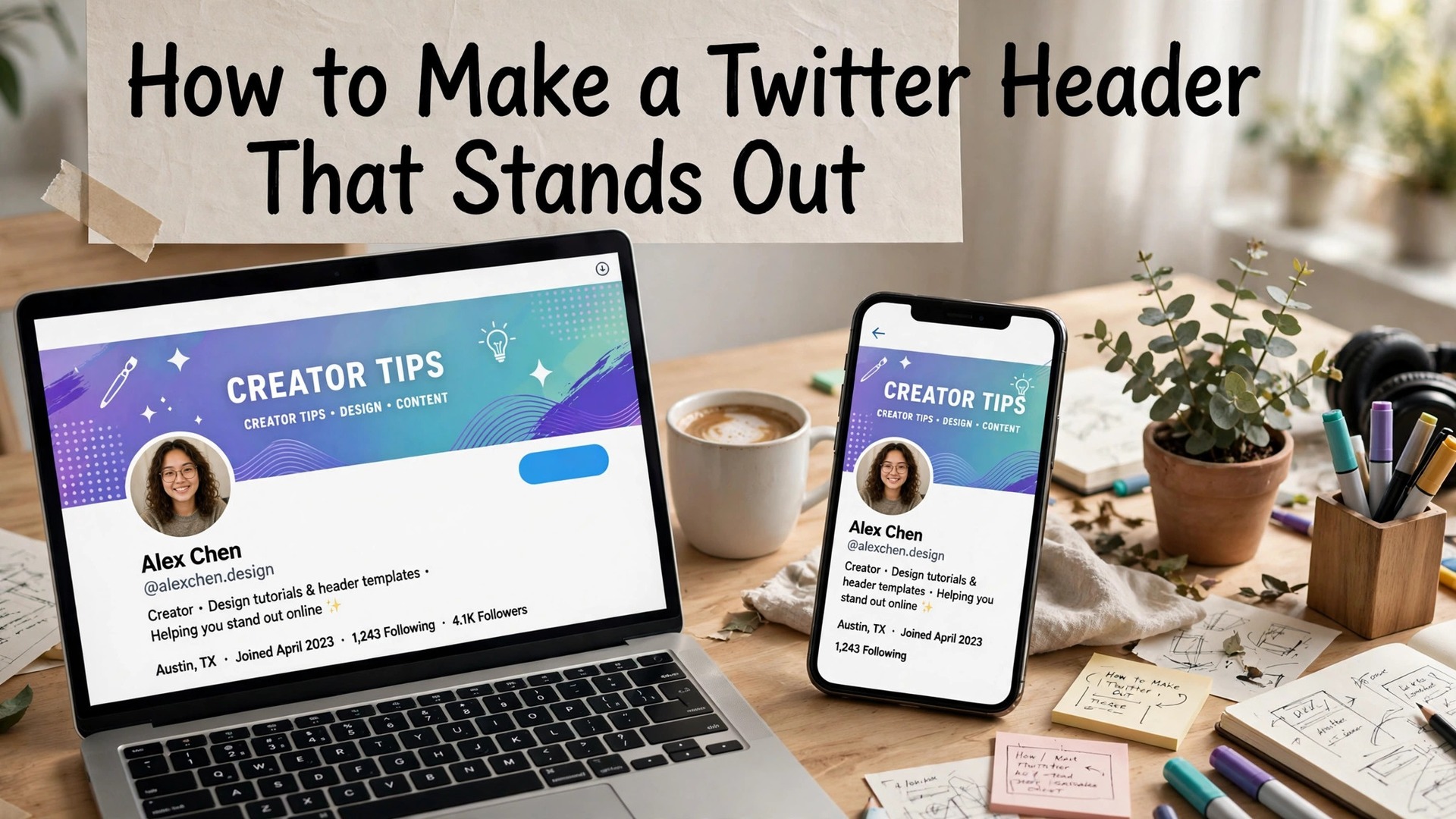
Learning how to make a twitter header that stands out takes about thirty minutes, and the result is the first thing anyone sees on your X profile. A sharp header says you take your work seriously. A stretched logo, a blurry photo or a default blue gradient says you set the profile up in a hurry and never came back. This guide walks through the whole job in seven steps, from the size to the upload, with free templates and design tips that work for a personal brand, a business and a creator.
A header is the largest image on your profile, and it works harder than most people think. Recruiters, clients and followers form a view of you in about two seconds, and the banner behind your photo carries most of that first impression. A header that names what you do, who you help, and what happens next earns the follow. A header that says nothing earns a scroll past, and the visitor never comes back to read the bio.
The trap is the crop. X shows the full 1500 by 500 header on desktop, but on a phone the sides are cut and the bottom is hidden behind your profile photo. Text placed near the edges simply disappears for most visitors, because most visitors are on a phone. Every step in this guide respects that crop, and the test at the end checks the header on a phone before you publish it, because a headline hidden behind your photo helps nobody.
In this article
Quick Answer. How to Make a Twitter Header in 30 Seconds
If you want the short version, here it is. Open Canva free, pick a 1500 by 500 header template, and swap in your photo, your headline and your colors. Keep the headline to six words or fewer, keep the text in the centre band where a phone will show it, and export as a PNG at full size. Upload the header to X, open your profile on a phone, and check that the text is readable and the logo is whole. Fix the crop before you publish, not after.
The seven steps below cover the size, the photo, the headline, the logo, the colors, the test and the upload, with free templates from Canva, Adobe Express and Snappa. That is how to make a twitter header that stands out in thirty minutes, and a second header takes ten, because the template, the fonts and the colors are already decided.
How to Make a Twitter Header That Stands Out in Seven Steps
The seven steps below are the whole job, in order, and each one builds on the last. The size comes first, because a header at the wrong size will look soft no matter how good the design is. The photo comes second, because the image carries the header. The headline comes third, because the words carry the message. The logo, the colors, the test and the upload follow, and the result is a header that stands out on desktop and on a phone.
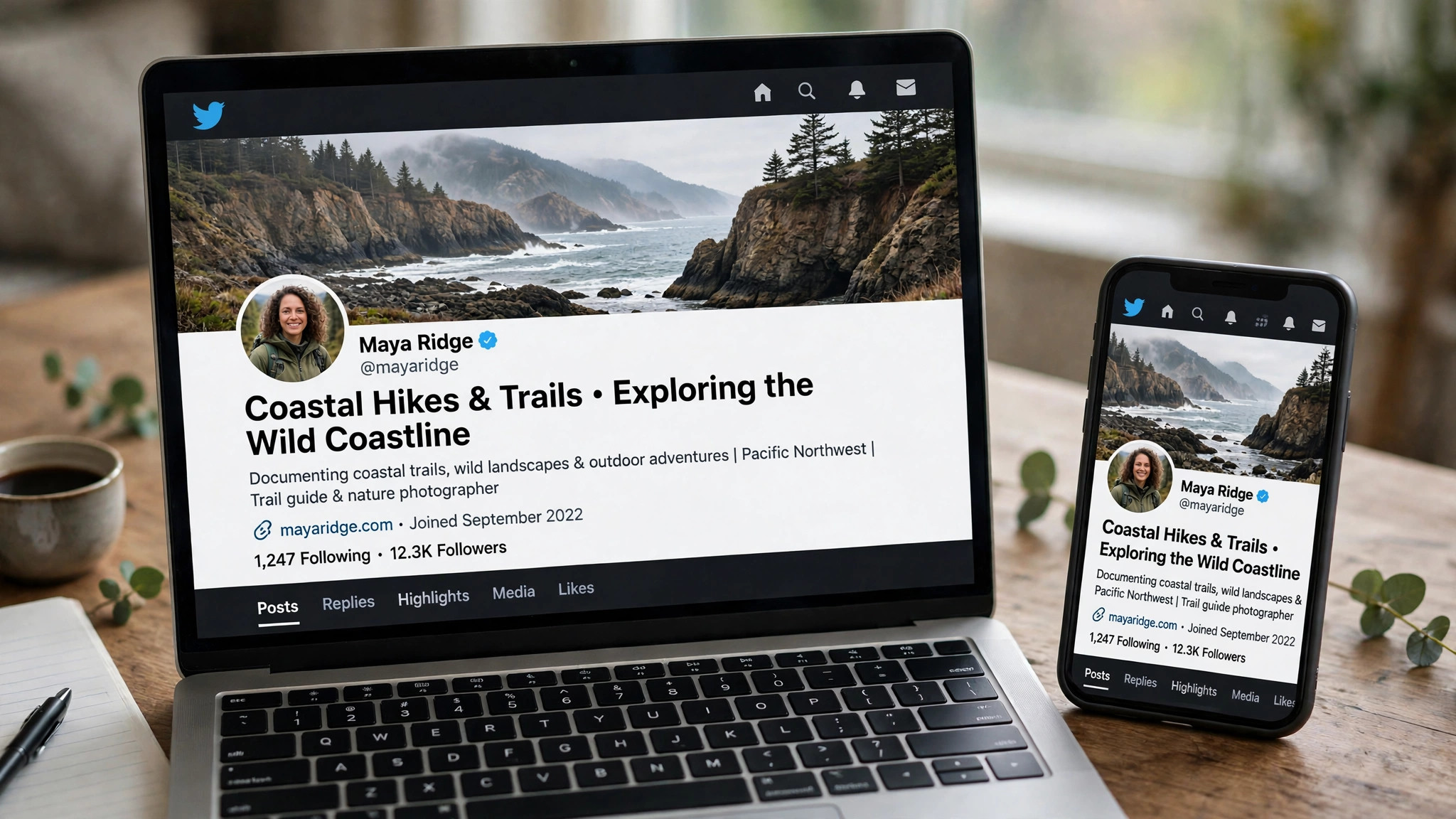
Step 1. Get the Size Right in Canva
Open Canva free and search for Twitter header, or open a custom canvas at 1500 by 500 pixels. That size is the one X recommends, and it is the size every template in this guide uses.
Getting the size right is the first step in how to make a twitter header that stands out, because a header at the wrong size will look soft no matter how good the design is. A header at the wrong size will be stretched or cropped by X, and a stretched logo looks worse than no logo at all. Canva opens the canvas at exactly 1500 by 500, with a template library that covers coaches, authors, podcasters, developers, designers and small shops, and most of the templates are free.
The safe area is the part of the canvas that a phone will show, and it is the middle band, about 1500 by 300 pixels in the centre, with the text and the logo inside it. Your profile photo covers the lower left corner, and the phone crops the left and right edges, so keep the headline, the logo and the call to action in the centre. Canva marks the safe area on several of its header templates. Snappa builds its templates around it by default. If a tool gives you no guide, draw a rectangle in the middle of the canvas and keep everything important inside it.
Export as a PNG for graphics with text, or a JPG for photos, and keep the file under 2 MB so the upload does not fail on a slow connection. A PNG keeps text sharp, and a JPG keeps a photo small. A file over 2 MB may be compressed harder by X, which softens the text. Check the export size before you upload, because a header at half size looks soft on a desktop monitor, and no template can fix that.
Step 2. Pick Your Photo in Adobe Express
The photo carries the header, so pick one that says what you do before a word is read. A coach might use a photo of a stage, a writer might use a photo of a desk, a developer might use a photo of a screen, and a shop might use a photo of its best product. The photo should be sharp, well lit and at least 1500 pixels wide, because X compresses every upload, and a low-resolution photo will look worse after upload than it did in the editor. Adobe Express is the best tool here for the photo, because its premium Adobe Stock library is sharper and less familiar than the free stock every other tool shares.
A photo with one subject and empty space for the text works best, because the text needs room to breathe. A busy photo behind thin white text disappears against a light sky or a pale wall, so add a dark overlay or a solid panel behind the text, and the same photo suddenly works. Adobe Express includes a one-click background tool and a library of overlays, and its free plan covers 25 generative credits a month, which is enough to test the photo and the overlay before you commit.
If you use your own photo, check it at full size before you place it, because a photo that looks sharp on a phone can look soft on a laptop. A photo taken on a modern phone is usually sharp enough, as long as it is at least 1500 pixels wide and the light is good. A photo taken in poor light will look noisy after upload, so pick a bright photo, or use Adobe Express to clean it up before you place it.
A second option is a solid color or a gradient, which suits a header that leads with words. A dark navy, a deep green or a warm charcoal background makes white text pop, and it never fights the headline the way a busy photo can. Canva and Adobe Express both include gradient tools, and a solid background is the safest choice when the photo is weak, because a clean color always looks intentional, and a weak photo always looks like a mistake.
Step 3. Write a Six-Word Headline
A header is not a bio, and the headline is not a sentence. Six words that say what you do and who it helps will be read. A full sentence will be skipped. Write the headline for the visitor who is deciding in two seconds, not for the visitor who already follows you. A coach might write Helping founders raise their first round. A writer might write Books about money, plainly explained. A developer might write Building tools that save you time. Each headline names the work and the audience in six words or fewer.
The headline should be large, bold and high contrast, with no more than three words on one line. A headline set at 24 points looks fine on a laptop and unreadable on a phone, so keep the text large enough to read at a glance. The headline is the heart of how to make a twitter header that stands out, because the words carry the message that the photo cannot. Canva has the strongest text tools here, with layered type, font pairings and animation, and Adobe Express adds Adobe Fonts, more than 30,000 typefaces, which means the headline can look like a designed post rather than a typed caption.
Put your name in the headline only if your handle does not already say it. A handle that reads your name does not need the name in the header, and the space is better spent on the work. A handle that reads a nickname or a brand should put the name in the header, so the visitor knows who they are following. A call to action, such as a book, a show or a newsletter, belongs in the header only if it fits in six words, because a longer call to action will be skipped.
Step 4. Add Your Logo and Proof in Snappa
The logo and the proof point are what make the header yours, and they belong in the centre band, away from the profile photo and the phone crop. The logo should be large enough to read on a phone, and the proof point should be one fact, such as a book, a show, a result or a credential. A header that says As seen in Forbes earns trust faster than a header that says Welcome to my profile, because the proof is specific and the welcome is not.
Snappa is the best tool here for this step, because its editor is the simplest in this list, with a short learning curve and no buried menus. You pick a header template, swap the text and the photo, and export, and the templates are built for social sizes from the start, so the safe area is already respected and the text sits where a phone will show it. The free plan covers 3 downloads a month, which is enough to test the header and make one final version.
Keep the logo and the proof point in the centre and right of the canvas, away from the lower left corner where your profile photo sits. A logo placed in the corner will be cut in half by the phone crop, and a proof point placed under the photo will be hidden. Check the placement on your phone before you publish, because a logo that is whole on desktop can be half hidden on a phone.
Step 5. Match Your Brand Colors
Color choice matters more on a header than on any other small design, because the header has to feel right in a feed of a hundred other headers. A header with two colors and one accent looks intentional. A header with five colors looks like a collage. Pick the two colors from your brand or your profile photo, use one accent for the call to action, and leave the rest of the space empty. Empty space is not wasted space on a header. It is what makes the words readable at a glance.
Canva Pro includes 5 brand kits, which lock in colors, fonts and logos across every header you make, and the free plan covers the basic brand tools well enough for a first header. Adobe Express includes brand kits on its Premium plan at $9.99 a month, and VistaCreate includes a brand kit on its Pro plan at $13 a month or $10 a month billed annually. A brand kit is worth paying for when the header is one of many graphics, because it keeps every design on brand without thinking.
Test the colors on a phone before you publish, because a color that looks good on a laptop can look washed out on a phone screen. A dark text on a light background reads best, and a light text on a dark background reads well too, as long as the contrast is high. A medium text on a medium background disappears, no matter how good the colors look in the editor. Check the contrast by squinting at the header, because a header that is readable when squinted is readable at a glance.
A useful trick is to take the two colors from your profile photo, because the header and the photo will match without effort. Pick the darkest color in the photo for the text, and the lightest color for the background, and the header will look like it belongs with the profile. Canva’s color picker can pull the palette from a photo in one click, and Adobe Express includes a color theme tool that builds a palette from any image.
Step 6. Test It on a Phone and a Desktop
Export the header, upload it to X, and open your profile on a phone before you call it done. Check that the text is readable, the logo is whole, and nothing important sits under your profile photo. Fix the crop before you publish, not after, because a header that is wrong on a phone is wrong for most visitors. The test takes two minutes, and it catches the mistakes that no editor can see, because the editor shows the full canvas and the phone shows the crop.
Check the header on a desktop too, because the full 1500 by 500 image shows there, and a header that looks good on a phone can look empty on a desktop. A header that is designed for the centre band will look good on both, because the centre is visible everywhere, and the edges are decoration. A header that is designed for the full canvas will look good on desktop and broken on a phone, because the edges are cut.
Ask a friend to look at the header and tell you what you do in one sentence. If they cannot, the headline is not clear enough, and the header needs another pass. A header that a stranger understands in two seconds is a header that works, and a header that needs explaining is a header that fails. The test is cheap, and the fix is fast, so do it before you publish, not after.
Step 7. Upload, Pin and Update
Upload the header to X by opening your profile, clicking Edit profile, and uploading the file as the banner image. X will show a preview, and you can drag the image to adjust the crop, though the crop is limited, so the safe area matters more than the drag. Save the header, open your profile on a phone, and check the result one more time. A header that looks right in the preview can still be wrong on a phone, because the preview shows the desktop view.
Pin a post that matches the header, because a visitor who likes the header will read the pinned post next, and a pinned post that matches the header earns the follow. A header that promises a book should pin the book. A header that promises a show should pin the show. A header that promises a service should pin the service. The header and the pinned post are a pair, and a pair that matches looks intentional.
Update the header when something real changes, such as a new book, a new service, a new show or a new offer. A header that changes every week looks unsettled. A header that never changes looks abandoned. Most profiles do well with a new header every three to six months, or whenever the pinned post changes, and a second header takes ten minutes, because the template, the fonts and the colors are already decided.
The Tools That Make It Fast
Three tools cover the whole job, and each one fits a different step in how to make a twitter header that stands out. Canva is the best all-round pick, with the largest template library, a free plan that exports a full-size header, and Pro at $18 a month or $144 a year. Adobe Express is the best pick if you want Adobe fonts and stock photos, with Premium at $9.99 a month. Snappa is the best pick for speed, because its editor is the simplest here and its templates are built for social sizes from the start.
VistaCreate is the pick for animated headers, with motion templates that stand out in a feed of static banners, and Pro at $13 a month or $10 a month billed annually. Fotor is the pick for photo-led headers, with strong photo tools and Pro at $39.99 a year. Pixlr is the pick when you already have a design and only need to resize it, with a free plan that opens in seconds and no install needed. Start with the free plan in two tools, test the header on your phone, and pay only when the free tier holds back a feature you actually need.
The Mistakes That Ruin a Header
A header fails for one of three reasons, and all three are avoidable, which is why knowing how to make a twitter header that stands out starts with knowing what ruins one. The first is text that is too small. A headline set at 24 points looks fine on a laptop and unreadable on a phone, so keep header text large, short and high contrast. Six words beat a full sentence.
The second is a logo placed in the corner, where the phone crop cuts it in half. Keep your logo and your name in the centre band. The third is a busy photo behind thin white text, which disappears against a light sky or a pale wall. Add a dark overlay or a solid panel behind the text, and the same photo suddenly works.
A fourth mistake is the template habit. A profile that uses the same Canva layout as a hundred other profiles does not stand out, and a header that looks like a template gets scrolled past. The fix is not a new tool. It is a template you adapt, with your own photo, your own colors, and a headline written for one audience. A header that looks like you will earn more follows than a header that looks like a template.
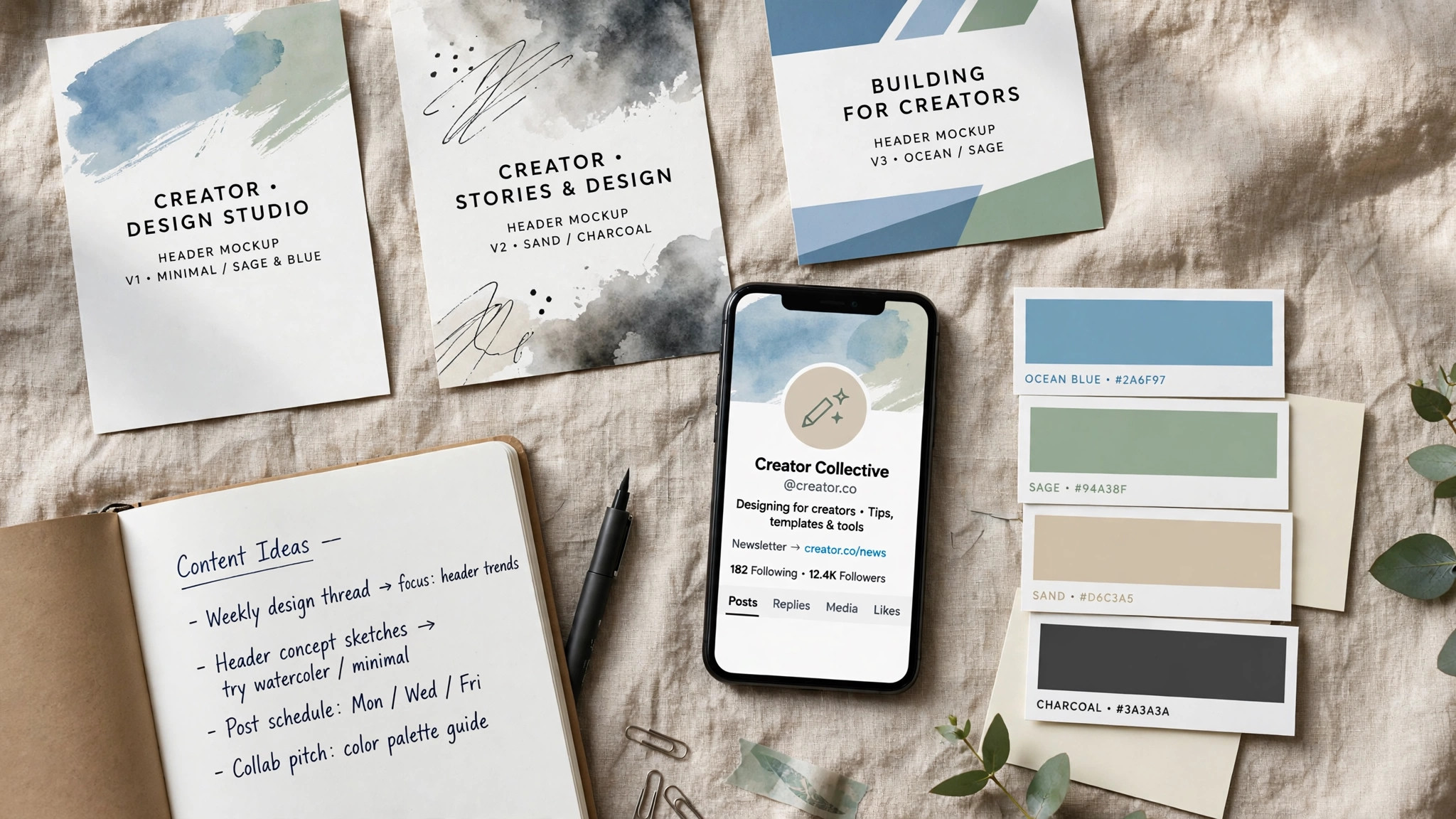
The Header Checklist. Before You Publish
Run through this checklist before you upload the header, because it catches the mistakes that no editor can see. The size is 1500 by 500 pixels, and the file is under 2 MB. The headline is six words or fewer, large, bold and high contrast, with no more than three words on one line. The text sits in the centre band, away from the profile photo and the phone crop. The logo is whole, the proof point is one fact, and the colors are two plus one accent.
Check the header on a phone, because most visitors are on a phone, and check it on a desktop, because the full image shows there. Ask a friend to look at the header and tell you what you do in one sentence. If they cannot, the headline is not clear enough, and the header needs another pass. A header that a stranger understands in two seconds is a header that works, and a header that needs explaining is a header that fails.
Save the design file, because the header will need updating in three to six months, when the book, the service or the offer changes. A saved file turns a new header into a ten-minute job, because the template, the fonts and the colors are already decided. A lost file turns it into a thirty-minute job, because the whole design has to be rebuilt from scratch. Save the file in Canva or Snappa, export a copy to your computer, and keep the photo and the logo in the same folder.
Related Guides
- How to Plan a Month of Social Media Content with AI
- How to Start a YouTube Channel with AI Tools
- Jasper vs Copy AI for Content Writing
Frequently Asked Questions

What size should a Twitter header be?
X recommends 1500 by 500 pixels, and that is the size every tool in this guide uses. Upload a file at least that large, keep it under 2 MB, and use PNG for graphics with text or JPG for photos. The header displays at 1500 by 500 on desktop, but phones crop the sides, so keep text and logos in the centre band.
Can I make a Twitter header for free?
Yes. Canva, Adobe Express, Snappa, VistaCreate, Fotor, Pixlr and BeFunky all have free plans that export a full-size header. Canva and Adobe Express have the strongest free tiers, because they include thousands of templates and full-size exports without paying. PicMonkey is the only tool here with no free plan, though its 7-day trial covers a header project.
How do I make a Twitter header that stands out?
Keep the headline to six words or fewer, use a real photo with one subject, and put the text in the centre band where a phone will show it. That is the short answer to how to make a twitter header that stands out. A header with two colors and one accent looks intentional, and a header with a proof point, such as a book or a result, earns trust faster than a header that says nothing. Test the header on your phone before you publish, because a headline hidden behind your photo helps nobody.
Why does my header look blurry after upload?
The usual cause is a low-resolution source. X compresses every upload, so a header built from a small photo or exported at half size will look soft. Start with a photo at least 1500 pixels wide, export at full size, and use PNG for text-heavy designs. A second cause is a file over 2 MB, which X may compress harder.
Can I use a video as my Twitter header?
X supports short video headers for some accounts, and VistaCreate is the best tool here for making one, with animated templates and looping backgrounds. Keep the video short, design the first frame as if it were a static header, and test it on a phone, because not every X client plays the animation.
How often should I change my header?
Change it when something real changes, such as a new book, a new service, a new show or a new offer. A header that changes every week looks unsettled. A header that never changes looks abandoned. Most profiles do well with a new header every three to six months, or whenever the pinned post changes.
The Bottom Line
Learning how to make a twitter header that stands out takes about thirty minutes, and the result is the first thing anyone sees on your profile. Open Canva free, pick a 1500 by 500 template, add your photo, write a six-word headline, and keep the text in the centre band where a phone will show it. Test the header on your phone, fix the crop, and upload it.
Canva is the best all-round pick for the design, Adobe Express is the best pick for the photo, and Snappa is the best pick for speed. Start with the free plan in two tools, test the header on your phone, and pay only when the free tier holds back a feature you actually need. A header that stands out is not the loudest header. It is the clearest one, and a clear header earns the follow.
1 thought on “How to Make a Twitter Header That Stands Out”