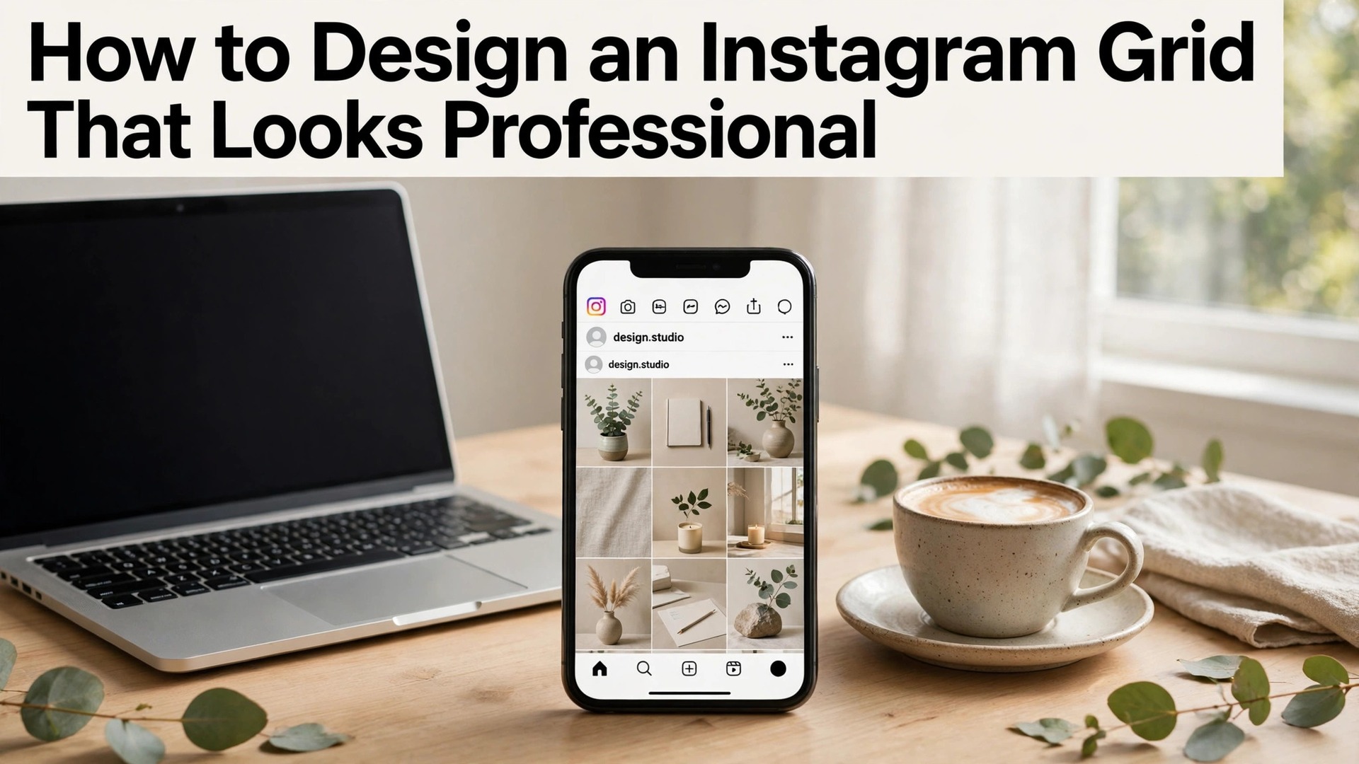
Learning how to design an Instagram grid that looks professional starts with a shift in how you see the app. Visitors do not judge your business by one post. They judge it by the nine squares they see when they open your profile, and that first impression takes about three seconds. A grid that looks planned tells a visitor the business is serious. A grid that looks random tells them the opposite, before a single caption is read.
The good news is that a professional grid is a system, not a talent. It comes from three decisions made once and repeated. A consistent colour palette, a repeating layout pattern, and a content mix that balances selling with helping. This guide covers all three, with the tools, the templates, and the weekly plan that keep a grid looking sharp without eating your whole week.
A professional grid is not about perfection. It is about recognition. A follower scrolling their feed should know a post is yours before they read the name, because the colours, the fonts, and the photo style match the last ten posts they saw. That recognition is what turns a casual viewer into a follower, and a follower into a customer.
Quick jump
- Quick Answer. A Professional Grid in 30 Seconds
- How to Design an Instagram Grid That Looks Professional in 5 Steps
- Layout Patterns That Work for Small Business
- Content Mix, Captions and Hashtags
- Tools for Planning, Previewing and Scheduling
- Photo Style, Editing Presets and the Nine-Square Test
- Keeping the Grid Fresh Without Breaking It
- Planning the Week, Nine Posts at a Time
- Grids for Different Kinds of Small Business
- Mistakes That Make a Grid Look Amateur
- Related Guides
- Frequently Asked Questions
- The Bottom Line
Quick Answer. A Professional Grid in 30 Seconds
Knowing how to design an Instagram grid that looks professional means planning nine posts at a time, not one. Pick three colours and two fonts from your brand kit, choose a repeating pattern such as photo, quote, photo, and post three to five times a week in that pattern. Canva is the fastest free tool for grid planning, with templates and a content planner on Pro at $18 a month or $144 a year. Preview and Planoly are dedicated grid planners with free plans for previewing the nine-square layout before you publish.
The three rules are simple. Every post must match the palette. Every row of three must look balanced. And every ninth post should be the strongest, because it sits in the bottom right of the first screen and anchors the whole grid. The rest of this guide proves that short answer, with layout patterns, content mixes, and the planning workflow in detail.
| Grid element | Professional choice | Amateur mistake |
|---|---|---|
| Colours | Three brand colours, used on every post | A new colour scheme every week |
| Layout pattern | A repeating rhythm, such as photo, quote, photo | Nine unrelated posts in a row |
| Photo style | Same light, same editing preset, same crop | Mixed filters and random crops |
| Captions | Short hook first, value second, one question | A wall of hashtags with no hook |
| Posting rhythm | Three to five posts a week, same days | Ten posts one week, silence the next |
How to Design an Instagram Grid That Looks Professional in 5 Steps
Step one is the palette. Take the three colours from your brand kit, and add a neutral, such as white, cream, or soft grey, for breathing room. Every post must use only these colours. A photo can carry other colours, but the text, the borders, and the graphics stay inside the palette. This single rule does more for a professional look than any filter or template.
Step two is the pattern. Choose a repeating layout for rows of three. The most reliable pattern is photo, graphic, photo, which gives the grid a calm rhythm and leaves room for quotes and announcements. A second pattern is three columns by theme, with the left column for products, the middle for tips, and the right for people. A third pattern is the checkerboard, which alternates photo and graphic in every square, and suits a business with strong graphic design. Pick one pattern and keep it for at least a month.
Step three is the photo style. Choose one editing preset and apply it to every photo. The preset should set the brightness, the warmth, and the contrast to the same values, so a photo taken on Tuesday matches a photo taken in March. Free presets exist in Lightroom Mobile, VSCO, and Canva, and a paid preset pack costs a few dollars. Consistency in editing is what makes a grid look expensive, even when the photos come from a phone.
Step four is the template set. Build three templates in Canva, one for a quote, one for a tip, and one for an announcement, all in the palette and fonts. Every graphic post uses one of these three, so the grid stays coherent even when the content changes. A template set of three is enough, because more templates invite more variation, and variation is the enemy of a professional grid.
Step five is the preview. Before you publish anything, lay out the next nine posts in a planner such as Preview or Planoly, and look at the whole grid. Move posts until every row of three looks balanced, with no two dark posts side by side and no two text posts touching. A grid planned nine at a time looks professional. A grid posted one at a time looks accidental.
Layout Patterns That Work for Small Business
The row pattern is the easiest to run. Each row of three tells one small story, such as a product, a tip about it, and a customer using it. The rows can stand alone, which means a missed week does not break the grid, and a new visitor sees a complete idea in every row. This pattern suits shops, cafes, and service businesses that post about real work.
The column pattern is the most organised. Each column carries one theme for weeks at a time. The left column shows products, the middle column shows tips, and the right column shows people and behind-the-scenes moments. A visitor scanning down a column sees depth in one topic, which builds trust fast. The cost is discipline, because a column pattern breaks if you post a product in the tips column by mistake.
The checkerboard pattern is the boldest. Photo, graphic, photo, graphic, all the way down the grid. It looks striking and modern, and it suits a design-led business such as a studio, a florist, or a fashion shop. The risk is that it needs a steady supply of both photos and graphics, and a week with no good photo leaves a gap in the pattern that shows.
The puzzle grid, where one large image is split across nine squares, looks impressive and is a poor choice for most businesses. It breaks the moment you post a tenth square, it hides the individual posts from the feed, and it confuses visitors who see a slice of an image instead of a post. Use it for a launch week only, never as the permanent pattern.
The border pattern, where every post carries the same white border, is the simplest fix for a messy grid. A consistent border unifies photos of different styles, and it makes the grid look calm even when the content varies. The trade is that borders shrink each photo, so the grid can feel small on a phone screen. Use a thin border, not a thick one, and keep it the same width on every post.
Content Mix, Captions and Hashtags
A professional grid is not nine adverts. The mix that works for most small businesses is three kinds of post in rotation. One post that shows the product or the work, one post that helps the follower with a tip or an idea, and one post that shows the people behind the business. A grid of only product posts feels like a catalogue. A grid of only tips feels like a blog with nothing to buy. The mix is what builds both trust and sales.
Captions follow a simple shape. The first line is the hook, because Instagram shows only the first two lines before the reader must tap more. The hook should promise a result or ask a question, such as the three mistakes that ruin a sourdough, or would you pay 40 dollars for this. The middle of the caption delivers the value, in short lines with space between them. The end asks one question, because a question invites a comment, and comments tell Instagram the post matters.
Hashtags still work, but they work quietly. Use five to ten relevant hashtags, placed at the end of the caption or in the first comment, and keep them specific to your niche. A bakery in Manchester gains more from Manchester bakery and sourdough Manchester than from food and yummy, because specific hashtags reach people who might actually visit. Change the hashtags when the topic changes, and never copy the same thirty tags onto every post.
Posting three to five times a week is the right rhythm for most small businesses. Three posts keep the grid alive without exhausting the owner. Five posts suit a business with a photographer or a content day. Daily posting is unnecessary for a small business, and it usually lowers quality, which hurts the grid more than the extra posts help it. Pick the days, keep them, and let followers learn when to expect you.
Reels belong in the grid too, and they need the same care. A Reel cover should use the palette and the fonts, so the grid stays coherent when the Reel sits between two photos. A Reel with a random video frame as its cover breaks the grid, even when the video itself is good. Set the cover deliberately, every time, because learning how to design an Instagram grid that looks professional includes the covers, not only the photos. Set the cover deliberately, every time, and the grid will thank you.

Tools for Planning, Previewing and Scheduling
Canva is the best all-round tool for grid design. Its free plan includes templates, fonts, and photo editing, and Canva Pro at $18 a month or $144 a year adds the content planner, brand kits, and Magic Resize, which turns one design into a post, a story, and a Reel cover in seconds. The planner shows the grid as it will look, which removes the guesswork from the pattern.
Preview is the best dedicated grid planner. Its free plan lets you arrange posts, preview the grid, and plan captions, with a paid plan for unlimited posts and analytics. Preview suits a business that designs in Canva and plans in a separate app, because it shows the nine-square grid exactly as Instagram will show it. The drag and drop interface makes reordering a grid take seconds.
Planoly is the strongest choice for a business that schedules as well as plans. Its free plan covers basic planning, and paid plans add auto-posting, analytics, and comment management. Planoly shows the grid, the calendar, and the analytics in one place, which suits a business with a weekly content routine. Its template library is smaller than Canva, so most users design in Canva and schedule in Planoly.
Later is the best option for a business that posts across several platforms. It plans Instagram, TikTok, Facebook, and Pinterest from one calendar, with a free plan for basic scheduling and paid plans for analytics and team seats. Its grid preview is clear, and its best-time-to-post suggestions help a business that does not know when its followers are online.
Lightroom Mobile is the tool for the photo style. Its free plan includes presets and editing tools, and the paid plan adds cloud sync and advanced colour controls. Build one preset, save it, and apply it to every photo before it reaches the grid. A preset applied consistently is the cheapest way to make phone photos look like they came from one camera on one day.
Photo Style, Editing Presets and the Nine-Square Test
A photo style is a set of choices repeated every time. The same brightness, the same warmth, the same contrast, the same crop. A grid where one photo is dark and moody and the next is bright and airy looks like two businesses sharing an account. A grid where every photo shares the same light looks like one business with a clear eye, even when the subjects change completely.
Build the preset from your best photo, not your worst. Take a photo you love, edit it until it looks the way you want the brand to look, and save those settings as a preset. Then apply the preset to the next ten photos and check whether they all improve. A preset that works on one photo and ruins nine others is not a preset, it is a filter, and it needs adjusting until it works across the range of your real photos.
The nine-square test is the check that matters. Before you publish, look at the next nine posts as a grid. Ask three questions. Does any one post shout louder than the rest. Are the dark and light posts spread evenly. Does the grid tell a visitor what the business does in three seconds. If the answer to any question is no, move a post, swap a cover, or replace a graphic. Ten minutes of rearranging saves a month of a grid that looks wrong.
Archive the posts that break the grid. Instagram lets you archive a post without deleting it, which means a post that no longer fits can leave the grid quietly. A grid that keeps its old, off-brand posts looks like a business that does not care. A grid that archives them looks like a business that is always improving. Archive generously, and delete nothing, because an archived post can return if the brand changes back.
Keeping the Grid Fresh Without Breaking It
A grid needs freshness, or followers stop noticing it. The safe way to refresh is to change one element at a time. Change the accent colour for a season, keep the fonts and the pattern. Change the photo style slightly for summer, keep the palette. A grid that changes one thing feels alive. A grid that changes everything feels like a new business, and followers must learn it again.
Seasonal moments are the easiest freshness. A Christmas post in the palette with a red accent, a summer post with brighter photos, a launch post with a new product in the same template. The season changes the content, not the system, and the grid stays recognisable through every season. That is the difference between a brand and a mood.
User photos are a powerful freshness tool, if they are edited to fit. A customer photo, reposted with the brand preset applied and the brand template as a frame, adds social proof without breaking the grid. Ask permission first, credit the customer in the caption, and apply the preset before you post. A raw customer photo dropped into a polished grid stands out for the wrong reason.
Review the grid once a month. Open the profile on a phone, look at the nine squares, and ask whether a stranger would understand the business in three seconds. If the answer is yes, keep going. If the answer is no, find the post that breaks the pattern and fix it, or archive it. A monthly review takes five minutes, and it is the habit that keeps a professional grid professional. That review is the quiet half of how to design an Instagram grid that looks professional, and it matters as much as the first plan.

Planning the Week, Nine Posts at a Time
A grid plan starts on paper, or in a planner app, with nine empty squares. Fill the squares with ideas before you design anything, because a grid planned as ideas is stronger than a grid planned as images. Write the nine ideas as short lines. A new product, a tip about using it, a customer photo, a behind-the-scenes moment, a price announcement, a question for followers, a seasonal post, a staff introduction, and a Reel. Nine ideas, each with a job, and the grid already has a shape.
Assign each idea a format. Photos suit products, people, and places. Graphics suit tips, quotes, and announcements. Reels suit process, movement, and personality. A grid where every idea is a photo feels flat, and a grid where every idea is a graphic feels like a brochure. The mix of formats is what makes the grid feel alive when a visitor scrolls it.
Design the nine posts in one sitting, if you can. A content day, once a week or once a fortnight, is how small businesses keep a grid consistent without thinking about it daily. Photograph the products, design the graphics, write the captions, and load the nine posts into the planner. The rest of the week is then free for running the business, and the grid publishes on schedule without a daily scramble.
Captions deserve the same batch treatment. Write all nine captions in the same sitting, in the same voice, so the grid reads like one person wrote it. A caption written in a rush on a Tuesday sounds different from a caption written calmly on a Sunday, and followers notice the shift even when they cannot name it. Batch writing keeps the voice steady, and a steady voice builds trust.
Leave one square empty in every plan. A spare square is room for the unexpected, such as a customer story, a sudden event, or a post that performs so well it deserves a follow-up. A plan with no spare square breaks the first time something good happens, and the business must then choose between the plan and the moment. Keep the spare square, and the grid can bend without breaking.
Grids for Different Kinds of Small Business
A cafe grid lives on food and place. The photos should be taken in the same light, at the same table, with the same plates, so every dish looks like it came from the same kitchen. The graphics should carry the menu, the opening hours, and the events, in the palette and the fonts. The people posts should show the barista, the baker, and the regulars, because a cafe sells belonging as much as coffee.
A shop grid lives on products and detail. Photograph each product the same way, on the same surface, with the same light, so a visitor can compare items fairly. Use close-up shots for texture and detail, and wide shots for the collection. The graphics should carry prices, sizes, and availability, because a shopper who must ask for the price in a message may not ask at all.
A service business grid lives on proof and people. A cleaner, a gardener, a tutor, or a repair shop should show before and after photos, short tips, and the faces of the team. A service is invisible until it is shown, so the grid must show the work, not only describe it. A photo of a finished job, with a short caption about what was done, is the most persuasive post a service business can make.
A creative business grid lives on process. A florist, a jeweller, a designer, or a maker should show the work in progress, the tools, the materials, and the finished piece. Process posts build desire, because followers who watch something being made want to own the result. The grid should feel like a studio visit, with the maker visible and the craft clear.
A food business grid lives on appetite. Photograph food in daylight, near a window, on a plain plate, with the dish as the hero and nothing competing with it. Avoid stock photos of food you do not serve, because a guest who orders the dish in the photo and receives something different will not return. Real food, photographed well, beats perfect food photographed by someone else.
Mistakes That Make a Grid Look Amateur
The first mistake is random filters. A different filter on every photo is the fastest way to make a grid look amateur, because the eye sees nine different moods instead of one business. Pick one preset, use it everywhere, and let the content provide the variety.
The second mistake is text that is too small. A graphic with ten lines of small text is unreadable in the feed, and it looks worse in the grid, where the square is the size of a thumbnail. Keep graphic text to seven words or fewer, in a font large enough to read at thumbnail size. If the message needs more words, put them in the caption.
The third mistake is posting only when there is something to sell. A grid that is nine adverts in a row tells visitors the business only talks when it wants money. Mix in tips, people, and behind-the-scenes posts, and the selling posts will work harder, because followers who trust you buy from you.
The fourth mistake is ignoring the profile itself. A grid can be perfect and still fail if the bio is empty, the profile picture is a blurry logo, and the highlights are unnamed. Set the profile picture to the logo icon, write a bio that says what you do and where you are, and name the highlights clearly, such as Menu, Prices, Reviews, and Visit Us.
The fifth mistake is inconsistency. Three posts one week, silence for a month, then ten posts in two days. Instagram rewards steady posting, and followers reward it too, because they learn when to expect you. A modest rhythm kept for six months beats a heroic month followed by silence.

Related Guides
- How to Grow a Small Business on TikTok
- How to Grow on Instagram with AI Tools
- How to Make a Twitter Header That Stands Out
Frequently Asked Questions
How many posts should I plan for a professional grid?
Plan nine posts at a time, because nine squares fill the first screen of your profile. That nine-at-a-time habit is the core of how to design an Instagram grid that looks professional. Planning in nines keeps every row balanced and stops the common error of posting one square that breaks the pattern. A rolling plan of the next nine posts is enough, and you can update it weekly.
What is the best layout pattern for a small business grid?
The photo, graphic, photo pattern is the most reliable for a small business, because it is easy to run and it keeps the grid calm. The column pattern suits a business with three clear themes, and the checkerboard suits a design-led business. Pick one pattern, keep it for a month, and change it only when you have a reason.
How do I make my Instagram photos look consistent?
Build one editing preset in Lightroom Mobile or Canva, and apply it to every photo before posting. The preset should set brightness, warmth, and contrast to the same values, so photos taken on different days look like they came from one shoot. Consistency in editing matters more than the camera you use.
Should I use a grid planner app?
Yes, if you care about the nine-square look. A planner such as Preview or Planoly shows the grid before you publish, so you can move posts until every row looks balanced. Designing one post at a time and hoping the grid works out is how most grids go wrong.
How often should a small business post on Instagram?
Three to five times a week is the right rhythm for most small businesses. Three posts keep the grid alive without exhausting the owner, and five suit a business with a content day or a photographer. Daily posting is unnecessary, and a heroic week followed by a silent month hurts the grid more than it helps.
How do I fix an Instagram grid that already looks messy?
Archive the posts that break the pattern, starting with the ones that clash hardest with your palette. Repairing a messy grid is part of how to design an Instagram grid that looks professional, and it works because the first screen refreshes as new posts push the old ones down. Then plan the next nine posts in your new pattern, and publish them steadily. A grid recovers in three weeks, because the first screen refreshes as new posts push the old ones down.
The Bottom Line
Knowing how to design an Instagram grid that looks professional is a system, not a talent. Three colours, two fonts, one preset, one pattern, and a plan of nine posts at a time. Canva will build the templates, Preview or Planoly will show the grid before you publish, and a monthly review will keep it sharp.
Start with the palette and the pattern, plan the next nine posts, and publish them on a steady rhythm. That is how to design an Instagram grid that looks professional, and it works for a cafe, a shop, a service business, or a maker. The grid that looks professional is the one that looks planned, and a planned grid is what turns a profile visitor into a follower, and a follower into a customer.
1 thought on “How to Design an Instagram Grid That Looks Professional”