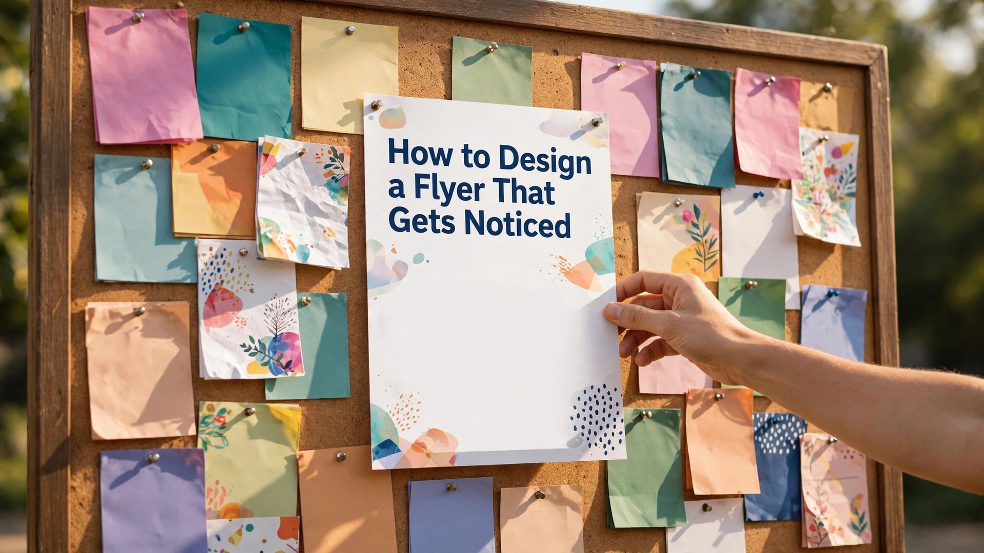
Learning how to design a flyer that gets noticed starts with one honest test. Tape your flyer to a busy noticeboard, step back three metres, and give it two seconds. If a passerby cannot read the headline and understand the offer in that time, the design has failed, no matter how pretty it looks up close.
Most flyers fail for the same three reasons. The headline is too small, the page is crowded with equal-sized text, or the call to action hides at the bottom in a colour nobody can read. Fix those three things and a flyer made in a free tool will outperform a flyer made by a professional who ignored them. This guide walks through the full process, from the one-line message to print-ready files, using tools anyone can open today.
A flyer is not a poster and it is not a brochure. A poster shouts from a distance. A brochure tells a story across folds. A flyer has one job, which is to turn a glance into an action. Someone picks it up, reads the offer, and either visits, calls, scans, or keeps it. Every choice in this guide serves that single job, and anything that does not serve it gets cut.
Quick Answer. The Flyer Formula in 30 Seconds
Learning how to design a flyer that gets noticed means giving the reader five things in this order. One headline of five to seven words that states the benefit. One strong image or colour block that stops the eye. Three lines of essential detail and nothing more. One clear call to action with a phone number, QR code, or web address. And one visual hierarchy that makes the headline the biggest element on the page by a clear margin.
Canva is the fastest free starting point, with thousands of flyer templates and a free plan that exports print-ready PDFs. Adobe Express is the best free alternative when you want Adobe fonts and stock photos, with Premium at $9.99 a month. For print, export a PDF at 300 DPI with a 3 mm bleed and CMYK colour, and order a small test batch before you print hundreds.
The rest of this guide proves that short answer. It covers the message, the layout grid, colour and type, the free tools, print settings, and the mistakes that sink most flyers before anyone reads them.
| Element | What good looks like | Common mistake |
|---|---|---|
| Headline | 5 to 7 words, largest text on the page | A clever slogan nobody understands |
| Image | One photo or graphic, at least a third of the page | Four small clip-art images fighting for space |
| Details | Date, place, price, contact, nothing else | A full paragraph of background history |
| Call to action | One action, bold, with a QR code or number | Three different actions in three corners |
| Print file | PDF, 300 DPI, 3 mm bleed, CMYK | A low-resolution JPG printed from a phone |
How to Design a Flyer That Gets Noticed in 7 Steps
The seven steps below are the whole method. Each one takes minutes, and skipping one is how flyers end up ignored. Work through them in order, because each step depends on the one before it. A headline written after the layout is finished will never fit, and a print file exported before the proofread will carry the typo to five hundred copies.
Step one is the message. Write the single sentence a stranger must understand. Not the name of your business, and not a slogan. The sentence is the benefit or the event. A yoga studio writes free first class this Saturday. A bakery writes fresh sourdough every morning at 7. A fundraiser writes help us raise 5,000 dollars for the school library. If the sentence needs a second sentence to make sense, cut words until it stands alone.
Step two is the audience. A flyer for parents at a school gate uses different words from a flyer for students at a campus cafe. Parents want times, prices, and safety. Students want energy, price, and a social hook. Write the flyer for one reader, not for everyone who might see it, because a flyer written for everyone speaks to no one.
Step three is the size. A standard flyer is A5 or US half letter, 148 by 210 mm or 5.5 by 8.5 inches. A5 fits a hand, a bag, and a noticeboard pin. A4 works for a shop window where people read from a metre away. Pick the size before you design, because a layout built for A4 and shrunk to A5 turns every line of text unreadable.
Step four is the layout. Put the headline at the top, the image in the middle third, and the details plus call to action at the bottom. This is the order eyes follow. A flyer that puts the logo first and the offer last asks the reader to work for the information, and most readers will not.
Step five is the design pass. Choose two fonts at most, one for the headline and one for the body. Choose three colours at most, one dominant, one supporting, and one for the call to action. Add white space around every element so the page can breathe. White space is not wasted paper. It is what makes the headline visible.
Step six is the proofread. Read every word aloud, check every date and phone number twice, and ask one other person to read it cold. Fresh eyes catch the wrong date, the missing postcode, and the phone digit you typed twice. A flyer with a wrong date is worse than no flyer, because it sends people to the wrong place on the wrong day.
Step seven is the print file. Export a PDF, set the resolution to 300 DPI, add a 3 mm bleed, and convert the colours to CMYK. Print one copy first and hold it at arm’s length. If the headline reads clearly and the QR code scans from that distance, print the batch.
The Message Comes First, the Decoration Comes Last
Beginners open a template and start decorating. Experienced designers write the words first and decorate second. The reason is simple. A flyer is read in a fixed order, and the words decide whether the reader keeps going. The headline earns the first two seconds. The supporting line earns the next five. The details earn the decision. Decoration earns nothing on its own.
Write the headline as a benefit, not a label. Free pizza Friday beats Pizza Night. Learn guitar in six weeks beats Guitar Lessons. Half price winter coats beats Winter Sale. The benefit headline answers the only question a passerby asks, which is what is in it for me. A label headline answers a question nobody asked.
The supporting line has one job, which is to add the fact that makes the headline believable. Free pizza Friday, this Friday only, first 50 customers. Learn guitar in six weeks, no experience needed, instruments provided. Half price winter coats, Friday to Sunday, all sizes while stock lasts. Each supporting line adds a limit or a proof, and limits create urgency without shouting.
Then cut. Read the flyer and delete every word that does not change a decision. The history of your business does not change a decision. Your mission statement does not change a decision. The name of your street changes a decision only if people need to find you, and then it belongs in the details, not the headline. A flyer with forty words outperforms a flyer with two hundred words almost every time, because forty words get read and two hundred get skipped.
Test the message on a stranger if you can. Show the flyer for three seconds, hide it, and ask what the offer was. If they can repeat it, the message works. If they remember the colours but not the offer, the decoration beat the message, and the decoration needs to shrink.
Layout, Colour and Type That Make a Flyer Readable
A flyer layout is a grid, even when the grid is invisible. Divide the page into thirds. The top third holds the headline and the hook. The middle third holds the image and the supporting line. The bottom third holds the details and the call to action. This structure works because it matches how eyes move down a page, and it stops the common error of filling the top with a logo and burying the offer.
Hierarchy is the single most important design skill for flyers. Hierarchy means the most important element is the biggest, the second most important is the second biggest, and everything else is smaller. On a good flyer, the headline is at least twice the size of the body text, and the call to action is the only element in its colour. When everything is the same size, nothing is important, and the eye has nowhere to land.
Colour does two jobs. The first is stopping the eye, which a bold background or a strong accent colour does well. The second is guiding the eye, which a single contrasting colour on the call to action does. Use one dominant colour for the background or the headline, one supporting colour for secondary text, and one accent colour reserved for the action button or QR code box. More colours than that turn a flyer into confetti.
Type choices matter more than most people expect. A headline font should be bold and readable from three metres away, which rules out thin scripts and decorative fonts for the main message. A body font should be a clean sans serif at 11 points or larger on an A5 flyer, because anything smaller is unreadable in real light. Never use more than two fonts, and never set body text in all capital letters, which reads slowly and looks like shouting.
Contrast is a practical matter, not a style choice. Dark text on a light background reads best in daylight. White text on a dark background reads well only when the text is large and bold. Yellow text on white, light grey on white, and red on green all fail in real conditions, and they fail hardest for older readers and anyone with weak vision. Check the flyer in sunlight and in a dim hallway before you print.
Canva, Adobe Express and Free Tools for Flyers
Canva is the tool most small businesses reach for first, and the reasons are practical. The free plan includes thousands of flyer templates, a drag-and-drop editor, free stock photos, and PDF export. Canva Pro costs $18 a month or $144 a year and adds premium templates, background removal, Magic Resize, and brand kits that lock in your fonts and colours. For a flyer, the free plan is usually enough, because the template library and the export quality are the same on both plans.
Adobe Express is the strongest free alternative. Its free plan includes templates, Adobe Fonts, and a library of stock photos, and its Premium plan costs $9.99 a month with more templates, 100 GB of storage, and a content scheduler. Adobe Express suits flyers that need a polished, photographic look, because its stock library and font range are deeper than most free tools. Its editor is simpler than Canva in places, which suits a fast one-off flyer.
Microsoft Designer is a free option worth knowing. It generates flyer designs from a short written prompt, using AI image generation, and it is free with a Microsoft account. The results need editing, because generated text can carry spelling errors, so always replace generated headline text with your own typed text before export. It is a good tool for a first draft, not a final file.
For a fully free and open option, GIMP and Inkscape handle the design work without a subscription, and LibreOffice Draw can build a simple flyer from a blank page. These tools take longer to learn, so they suit a business that makes flyers every week, not a one-off event. The trade is time against money, and for a weekly flyer the time pays off.
Whatever tool you choose, keep the working file. Save the template, the fonts, and the colour values in one folder, so the next flyer takes twenty minutes instead of two hours. A consistent template is also how a small business starts to look like a brand, because the second flyer a customer sees should feel related to the first.
Print Settings That Stop a Good Flyer Looking Cheap
The print file is where good flyers are won or lost. Export as PDF, not JPG, because a PDF holds vector text that stays sharp at any size, while a JPG blurs when it is enlarged. Set the resolution to 300 DPI, which is the print standard for a flyer held in the hand. A 72 DPI image from a website will look soft and pixelated in print, even if it looks fine on a screen.
Bleed is the margin of extra design that runs past the cut edge. Set a 3 mm bleed on every side, and keep all text at least 5 mm inside the cut edge, in what printers call the safe zone. Without bleed, a tiny cutting error leaves a white hairline at the edge of the flyer. With text outside the safe zone, a cutting error can slice a letter in half.
Colour mode matters. Screens use RGB, printers use CMYK, and the two do not match exactly. Bright RGB blues and greens print duller in CMYK, so convert the file to CMYK before export and check the proof. If your tool does not offer CMYK export, ask the printer to convert it, and accept that neon colours will soften. Matte paper hides fingerprints and suits text-heavy flyers. Glossy paper makes photos pop and suits food and event flyers.
Paper weight is worth a line. Standard copy paper is 80 gsm and feels flimsy in the hand. A flyer on 150 to 170 gsm silk or gloss feels like a real piece of marketing, and it survives a bag and a noticeboard pin. For a handout that people keep, 200 gsm card works well. Ask the printer for a sample pack, because paper is cheap to test and expensive to regret.
Always print one copy first. Check the headline at arm’s length, check the QR code with a phone camera, and check the colours in daylight. This test print is part of how to design a flyer that gets noticed, because a file that looks right on screen can still fail on paper. A test copy costs pennies. A batch of five hundred with a wrong phone number costs the whole batch plus the reputation of the event.
Where to Put Flyers So People Actually See Them
A great flyer in the wrong place is invisible. The best spots are places where your reader already waits with nothing to do. Noticeboards in cafes, libraries, community centres, and laundries work because people stand and read while they wait. A flyer on a cafe board gets minutes of attention. A flyer handed out on a busy street gets one second before the bin.
Ask permission before you pin anything. Most cafes and shops have a board with rules, and a flyer pinned without asking is removed within a day. Offer the owner something in return, such as a flyer for their own event, or a mention on your social page. A good relationship with five venues beats a hundred flyers pinned once and thrown away.
Handouts work when the handover is personal. A short sentence beats a silent thrust of paper. Try this Friday, free first class, and point at the headline. People keep a flyer when a human has told them why it matters. They bin a flyer that arrives with no words and no eye contact.
Track what works. Put a different QR code or a different offer code on each batch, so you can see which venue brings visitors. A flyer that brings ten people from one cafe is worth repeating. A flyer that brings nobody from a train station is worth moving. Marketing without tracking is guessing, and guessing wastes print money.
Digital versions deserve the same care. Post the flyer as a square image on social media, as a PDF in an email, and as a story with a link sticker. The same file can work in all three places if the headline is large and the text is short. A flyer designed for print with tiny text will fail on a phone screen, so check the digital version on a phone before you post it.
Mistakes That Sink Most Flyers
The first mistake is too many words. A flyer is not a website, and nobody reads a wall of text on a piece of paper they picked up in passing. If your flyer has more than sixty words, cut it in half and test again. The words you cut were not doing any work.
The second mistake is a weak headline. A headline that names the business instead of the benefit wastes the largest text on the page. Your business name belongs in the footer in small text, with the contact details. The headline belongs to the customer and the benefit.
The third mistake is low-resolution images. A photo pulled from a social media post is usually 72 DPI and far too small for print. Use photos from your camera at full size, or stock photos downloaded at the largest size available. A blurry photo tells the reader the business is careless, and that message travels further than the offer.
The fourth mistake is no call to action. A flyer that ends with information and no instruction leaves the reader with nothing to do. Every flyer needs one verb. Visit, call, scan, book, or register. One verb, one place, one deadline if you can add one honestly.
The fifth mistake is designing for yourself instead of the reader. You love your logo, your colours, and your story. The reader loves a clear offer, a clear time, and a clear next step. Design for the reader and the flyer will work. Design for yourself and it will decorate your own fridge.
How to Design a Flyer That Gets Noticed for Different Events
The same method works for every event, but the details change with the audience. A flyer for a school fundraiser speaks to parents, so it leads with the date, the cause, and the amount being raised. A photo of the children or the school hall does more work than a stock image, because parents respond to faces they recognise. The call to action is simple, such as bring a plate on Friday, or buy tickets at the school office.
A flyer for a live music night speaks to a different reader. The band name is the headline if the band has fans, and the date and venue are the second line. A dark background with one bright accent colour suits a gig, and the image should be a photo of the band playing, not a generic guitar graphic. The call to action is the ticket link or the door price, and the age limit belongs in the details if one applies.
A flyer for a small business opening needs to answer three questions in order. What do you sell, where are you, and why should someone visit this week. An opening offer, such as 20 percent off on opening weekend, gives people a reason to come now instead of later. The map or the street address matters more than the logo here, because a new shop is found by location first and by name second.
A flyer for a class or workshop leads with the outcome. Learn to bake sourdough in one morning. Speak basic Spanish in eight weeks. The outcome headline is followed by the teacher’s name, the dates, and the price, because adults booking a class want to know who teaches it and what it costs before they commit. A short line about no experience needed removes the biggest barrier for beginners, and it costs only four words.
A flyer for a charity event or community clean-up leads with the cause and the time commitment. Two hours on Saturday morning, gloves provided, all welcome. People give time when the ask is small and specific, so state the hours honestly and name what you provide. A photo of volunteers at work beats a photo of an empty park, because people join people, not places. That is the human detail at the heart of how to design a flyer that gets noticed for a community event.
Seasonal flyers need one more check, which is the date. A Christmas market flyer printed in November is useful. The same flyer printed in the first week of December is late. Plan the print run so the flyer lands at least two weeks before the event, and add a second smaller run in the final week for the people who decide late. Two waves of flyers beat one large wave, because the second wave reaches the people the first wave missed.
Related Guides
- How to Make a QR Code for a Restaurant Menu
- How to Make a Wedding Invitation Online
- Vistaprint vs Canva for Business Cards
Frequently Asked Questions
How do I make a flyer that stands out on a crowded noticeboard?
Use one bold colour block, one large headline of five to seven words, and one strong image. Keep the rest of the page quiet. That is the core of how to design a flyer that gets noticed on a board full of competing pages. A flyer with one clear message beats a flyer with five messages, because the eye lands on the biggest element first and the brain reads it before moving on.
What size should a flyer be?
A5, which is 148 by 210 mm, or US half letter at 5.5 by 8.5 inches, suits most handouts and noticeboards. A4 suits shop windows where people read from further away. Pick the size before you design, because shrinking a finished layout makes the text too small to read.
What is the best free tool for making a flyer?
Canva is the best free starting point, with thousands of templates and PDF export at no cost. Adobe Express is the best free alternative for Adobe fonts and stock photos. Both export print-ready PDFs, and both are free to start, so try the same flyer in both and keep the one that feels easier.
How do I make a QR code for my flyer?
Use a free QR generator such as QR Code Generator or the QR tool inside Canva, and link it to your booking page, menu, or event page. Test the code at the printed size with a phone camera before you print the batch, and keep a short web address printed under the code for people whose camera will not scan.
How much does it cost to print flyers?
A small run of 100 A5 flyers on 150 gsm paper typically costs a few dollars from an online printer, with the unit price falling sharply at 500 or 1,000 copies. Prices vary by country, paper, and finish, so get quotes from two printers and print one test copy first.
How do I know if my flyer worked?
Put a trackable element on it, such as a unique QR code, a discount code, or a dedicated phone number. Count how many people use it, and compare venues. A flyer that brings ten visitors from one cafe is a success worth repeating, while a flyer with no tracking tells you nothing.
The Bottom Line
Knowing how to design a flyer that gets noticed comes down to discipline, not talent. One clear message, one large headline, one strong image, one call to action, and a print file set up properly. Canva will build it free, Adobe Express will polish it, and a test print will catch the errors before they cost money.
Start with the words, build the layout around them, and test the flyer at arm’s length before you print. That is how to design a flyer that gets noticed, and it works for a school fair, a gig, a shop opening, or a charity drive. The flyer that gets noticed is the one that respects the reader’s time, and that respect is what turns a glance into a visit.
1 thought on “How to Design a Flyer That Gets Noticed”