Canva, Adobe Express and Snappa are the best podcast cover makers for a new show, and the choice between them comes down to one thing. Do you want the biggest template library, the most polished fonts, or the fastest editor? All three export at the 3000 by 3000 pixel size that Apple Podcasts requires, and all three are free to start. The wrong choice is not any of these tools. It is a cover made in a phone app that exports at the wrong size and looks blurry in every podcast app.
A podcast cover is a tiny billboard. It appears at about the size of a thumbnail in a crowded list, next to hundreds of other shows, and a listener decides in a second whether to tap. That means the title must be readable at thumbnail size, the image must be bold enough to stand out, and the design must say what the show is about without a paragraph of explanation. The best podcast cover makers are the tools that make those three things easy.
The technical rules are strict and simple. Apple Podcasts requires a square image between 1400 by 1400 and 3000 by 3000 pixels, in JPG or PNG, and it rejects covers with blurry text, stretched images or tiny fonts. A cover that breaks those rules gets rejected, and a rejected cover delays a launch by days. Every tool on this list exports at the right size, but the good ones warn you before you export a cover that will fail.
The best podcast cover makers are not the ones with the most templates. They are the ones that help you make a cover a stranger can read, understand and remember at thumbnail size. This guide compares five of them, explains what makes a great cover, and lists the mistakes that cost new shows listeners before the first episode plays.
Quick jump
- Quick Answer. The Best Podcast Cover Makers in 30 Seconds
- What a Podcast Cover Really Costs
- What Makes a Great Podcast Cover
- Cover Mistakes That Cost New Shows Listeners
- How to Brief a Designer for Your Cover
- How to Choose the Right Option for Your Business
- Before You Publish a Podcast Cover. A Checklist
- Related Guides
- Questions Owners Ask Most
- The Bottom Line
Quick Answer. The Best Podcast Cover Makers in 30 Seconds
If you want the answer before the detail, here it is. Canva is the best all-round pick, with the largest template library built to podcast specs, free to use and Pro from $120 a year. Adobe Express is the best choice for a premium look, with Premium at $9.99 a month. Snappa is the fastest pick, free for three downloads a month.
Fotor is the best choice when your cover centres on a host photo, with Pro from $8.99 a month. Placeit is the best pick for gaming and tech shows. The rest of this guide proves that short answer, with a full comparison table, a detailed review of each tool, and answers to the questions new hosts ask most.
The table below compares all five of the best podcast cover makers on the four facts that change a buying decision. Free tier means what you can design and export without paying. Paid from means the cheapest plan that removes limits or watermarks.
| Tool | Best for | Free tier | Paid from | Key strength |
|---|---|---|---|---|
| Canva | Best all-round podcast cover maker | Free plan | Free, Pro from $120 a year | 3000×3000 templates, huge library |
| Adobe Express | Best for premium-looking covers | Free plan | Free, Premium $9.99 a month | Adobe fonts and stock, clean layouts |
| Snappa | Best for fast covers with no fuss | Free plan, 3 downloads a month | Free, Pro from $15 a month | Speed, simple editor, built-in stock |
| Fotor | Best for AI-enhanced cover photos | Free plan | Free, Pro from $8.99 a month | AI enhance, background remover, batch edit |
| Placeit | Best for mockups and niche templates | Free templates, watermarked | From $9.95 a month | Niche templates, mockups, episode art |
What a Podcast Cover Really Costs
The first number is the subscription, and the good news is that a podcast cover is usually free. Canva, Adobe Express, Fotor and Snappa all have free plans that cover a single cover, and their Pro plans cost $8.99 to $15 a month. A new show can design a professional cover for nothing, and the only cost is an afternoon of your time.
The second number is the designer. Hiring a freelance designer for a podcast cover costs $100 to $300, and a good designer is worth it for a show that plans to run for years. But a new show should test its concept first with a free tool, and hire a designer later once the show has an audience and a clear identity. A $200 cover for a show that stops after four episodes is money wasted.
The third number is the cost of a bad cover, which is invisible but real. A cover that is unreadable at thumbnail size loses listeners who never press play, and a cover that misleads listeners about the show brings the wrong audience and bad reviews. Spend the time to test your cover at thumbnail size, on a phone, next to the shows you compete with. That test is free, and it matters more than the tool you choose.
What Makes a Great Podcast Cover
A great cover does three things in one second. It can be read, it can be understood, and it can be remembered. Readable means the title is large enough to read at thumbnail size, with high contrast between text and background. Understandable means a stranger can guess the topic from the image and the title together. Memorable means the colours or the image stick in the mind after the listener scrolls past. If your cover fails any of the three, fix that one before you worry about the rest.
Start with the title. Use the show name in large type, and keep it to three or four words if you can. Long titles shrink to unreadable text at thumbnail size, so a show called The Daily Marketing Show for Small Business Owners should show The Daily Marketing Show, or even Daily Marketing, on the cover. The full name lives in the show description. The cover is a sign, not a paragraph.
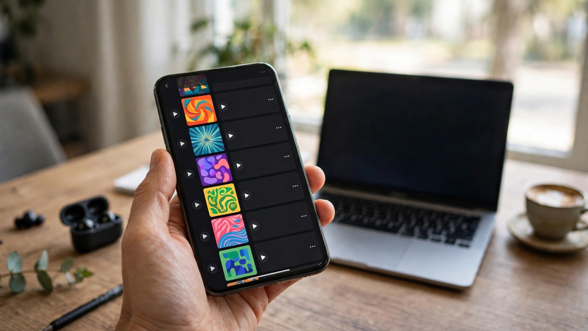
Next, pick one image and commit to it. A host photo, a bold illustration, or a single strong object all work. Two images compete, three images confuse, and a busy background hides the title. The best podcast covers in any category use one image, one colour palette and one font. That restraint is what makes them stand out in a crowded list.
Colour is the cheapest way to stand out. Most podcast covers use dark backgrounds with white text, so a warm yellow, a bright coral or a deep teal cover jumps off the page. Pick a colour that fits the show mood, a warm colour for a friendly show, a dark colour for a serious one, and use it consistently across the cover, the website and the social posts. Consistency builds recognition, and recognition brings listeners back.
Finally, test the cover where listeners will see it. Shrink it to thumbnail size on your phone, place it next to five shows in your category, and ask a friend which one they would tap. If they pick yours, you are done. If they pick another, ask why, and change one thing. A cover is never finished in the editor. It is finished in the feed.
1. Canva. Best all-round podcast cover maker
Canva is the obvious first pick for podcast art, and it earns that spot. Templates are built to the 3000 by 3000 pixel standard that Apple Podcasts requires, the font library is strong, and the background remover makes a clean host photo easy. Most shows can design a cover in an afternoon, export it, and upload it the same day. The risk is looking like every other Canva cover, so change the colours and fonts rather than accepting the template as is.
Canva is free for most cover work, and Pro costs $120 a year or $15 a month for premium templates and background removal. There is nothing else to pay. The free plan alone produces a professional cover, which is why so many new shows start here.
What works. Templates match podcast specs, the editor is fast, and background removal helps.
Watch out for. Popular templates repeat across shows, so customise or blend in.
On balance, Canva earns its place for one reason. 3000×3000 templates, huge library. At Free, Pro from $120 a year, the value is fair for a business that needs best all-round podcast cover maker. Try the free tier first (Free plan), and order a small batch before you commit. If the result matches the promise, reorder with confidence. If it does not, the table above shows the next best option for the same job.
2. Adobe Express. Best for premium-looking covers
Adobe Express makes covers that look a step more considered than the average template job. Adobe Fonts gives you typefaces with character, and the stock library covers the moody, bold imagery that podcast art needs. Layouts are clean, and the editor stays simple. If your show competes in a crowded category, the extra polish is worth the small effort of learning a second tool.
Adobe Express is free for basic cover work, and Premium costs $9.99 a month, unlocking premium fonts, templates and stock. Export at 3000 by 3000 in one click. The price is low for the quality, and the free plan is enough to test it properly.
What works. Fonts and stock look premium, layouts are clean, and the price is low.
Watch out for. Template count is smaller than Canva, and there is no audio tooling.
Who should pick Adobe Express? A business that wants best for premium-looking covers and values adobe fonts and stock, clean layouts. The price, Free, Premium $9.99 a month, is reasonable for what you get, and the free tier (Free plan) removes the risk of trying it. The trade is the one named above, and for the right buyer it is a small price. For anyone else, a different row in the table fits better.
3. Snappa. Best for fast covers with no fuss
Snappa is the fast pick. The editor has fewer options than Canva, which sounds like a weakness until you are designing a cover at midnight and want it done. Pick a template, swap the title and photo, export at the right size, and you are finished. Stock photos are built in, and the text tools are clean. It suits a host who wants a good cover without a design project.
Snappa is free for three downloads a month, and Pro costs $15 a month for unlimited downloads. A single cover fits inside the free plan, so try it before paying. The subscription makes sense only if you also make social graphics.
What works. The editor is fast and simple, stock is built in, and a single cover is free.
Watch out for. Free plan limits downloads, and templates are basic.
Snappa is a specialist, not an all-rounder, and that is its strength. Speed, simple editor, built-in stock is what it does best, and at Free, Pro from $15 a month it does it at a fair price. Start with the free tier (Free plan, 3 downloads a month) and test it on a real job. If it handles that job well, it will handle the next one too. Specialists beat generalists when the job matches, and this one matches best for fast covers with no fuss.
4. Fotor. Best for AI-enhanced cover photos
Fotor is the pick when your cover centres on a host photo. Its one-click enhance sharpens dull phone photos, the background remover is quick, and the portrait tools clean up skin and light without looking fake. Templates are fewer than Canva, but the photo tools are stronger, and a sharp host photo is what makes a podcast cover stand out in a feed of illustrations.
Fotor is free with ads and limits, and Pro starts at $8.99 a month billed yearly. That is cheap for the AI tools. If your cover is photo-led, the enhance tool alone can justify the price.
What works. Photo enhancement is strong, background removal is fast, and Pro is cheap.
Watch out for. Templates are fewer, and the free plan shows ads.
The practical case for Fotor comes down to aI enhance, background remover, batch edit. At Free, Pro from $8.99 a month, you pay for that, and for a business where best for AI-enhanced cover photos matters, the price is justified. The free tier (Free plan) means you can check the quality before you pay. Order small, test properly, and scale up only when the results prove the choice.
5. Placeit. Best for mockups and niche templates
Placeit suits shows in gaming, tech and entertainment, where its templates match the audience style. The mockup library also helps, since you can preview your cover on a phone screen, a poster or a laptop before publishing. The editor is template-driven, so you swap text and art rather than designing freely. If your show fits a Placeit niche, the results look like they belong.
Placeit subscriptions start at $9.95 a month for unlimited downloads, with annual plans cheaper. Free templates carry watermarks, so budget for the subscription. It also covers logos and mockups, so the value extends beyond one cover.
What works. Niche templates fit gaming and tech shows, mockups preview the real result, and the subscription covers a lot.
Watch out for. Free downloads are watermarked, and the editor is template-bound.
Put simply, Placeit is worth trying if best for mockups and niche templates is your priority. Niche templates, mockups, episode art is the reason, and at From $9.95 a month the cost is fair for the quality on offer. The free tier (Free templates, watermarked) lets you test without risk, so there is no reason to guess. Try it on a real job, judge the result, and decide from evidence rather than from a product page.
Colour is the cheapest way to stand out, and it deserves a second look. Test your cover in greyscale first. If the title is still readable and the image still works without colour, the design is strong. Then add colour back, one colour at a time, and stop when the cover feels complete. A cover with two colours looks confident. A cover with five looks confused, and the listener will not know where to look first.
A final check costs nothing and saves launches. Show the cover to five people who have never heard the show, ask them what they think it is about, and believe their answers. If they guess the topic, the cover works. If they guess wrong, change one thing, the image, the colour or the title, and test again. A cover is never finished in the editor. It is finished in the feed, next to the shows it competes with.
Cover Mistakes That Cost New Shows Listeners
The most common mistake is tiny text. A host writes the show name, the tagline, the episode number and a website address on the cover, and none of it is readable at thumbnail size. Cut everything except the show name and one image. The tagline belongs in the description. The website belongs in the show notes. The cover has one job, and it is to get a tap.
The second mistake is a photo that does not survive shrinking. A group photo of four hosts becomes four tiny faces at thumbnail size, and none of them is readable. One host, close up, with a clear expression, works far better. If the show has two hosts, use a bold illustration or a single object instead, and save the group photo for the website.
The third mistake is using a template without changing it. The most popular Canva podcast templates appear on hundreds of shows, and listeners learn to ignore them. Change the colours, change the fonts, and change the image. A template is a starting point, not a finished cover. Ten minutes of customisation is the difference between a cover that blends in and one that stands out.
The fourth mistake is ignoring the technical rules. Apple Podcasts rejects covers below 1400 by 1400 pixels, and it rejects covers with blurry or stretched images. Export at 3000 by 3000, in JPG or PNG, and check the file before you upload. A rejected cover delays a launch, and a delayed launch costs momentum that a new show cannot afford.
The fifth mistake is designing for yourself instead of for the listener. A host picks colours they like, a font they like, and an image they like, without asking whether a stranger would understand the show from the cover. Show the cover to five people who have never heard the show, ask them what they think it is about, and believe their answers. If they guess wrong, the cover is wrong, however much you like it.
How to Brief a Designer for Your Cover
If you hire a designer for your cover, the brief decides the result. Start with the show in one sentence, who it is for and what they get from listening. A designer who understands the listener can design for them. A designer who only knows the show name will design something generic. Include three shows you admire and say what you like about each cover, the colours, the type, the mood. That gives the designer a direction without dictating the answer.
Give the designer the constraints up front. The cover must work at 3000 by 3000 pixels, the title must be readable at thumbnail size, and the design must use one image and one colour palette. Mention the category, because a business show and a true crime show need different moods. Set a deadline, a budget and the number of revisions included, so there are no surprises on either side.
Judge the first draft at thumbnail size, on a phone, next to the shows you compete with. That is where listeners will see it, and that is where it has to win. Ask the designer for two or three directions rather than one polished cover, because choosing between directions is easier than fixing a single design you do not love. The best podcast cover makers in this guide can produce a good cover for free, so use them to test your concept before you pay a designer to refine it.
Among the best podcast cover makers, the right choice is the one that helps you make a cover a stranger can read, understand and remember at thumbnail size.
How to Choose the Right Option for Your Business
Start with the show, not the tool. A solo interview show needs a host photo and a clear title. A storytelling show needs a bold illustration and a mood. A business show needs clean type and a professional colour. Pick the image first, then pick the tool that makes that image easy. Canva handles all three, Adobe Express suits the polished look, and Fotor suits the photo-led cover.
Next, check the size before you design. Set the canvas to 3000 by 3000 pixels, and keep the title and the main image inside a safe margin, so nothing gets cropped in different apps. Design at full size, then shrink to thumbnail size and check readability on a phone. If the title is unreadable at thumbnail size, make it bigger or cut words.
Then customise the template. Change the colours to your brand, change the fonts to something with character, and replace the stock photo with your own image. A template that still looks like the template is a cover that blends in. Ten minutes of changes is enough to make it yours.
Finally, ask strangers, not friends. Friends say a cover looks nice. Strangers tell you whether they would tap it, and what they think the show is about. Show it to five strangers, or post it in a creator group, and listen to the answers. The cover is for listeners you have not met yet, so their opinion is the one that counts.
Before You Publish a Podcast Cover. A Checklist
- Exported at 3000 by 3000 pixels, in JPG or PNG, as Apple requires
- Title is readable at thumbnail size on a phone, in one second
- One image only, with one colour palette and one font
- Template customised, with your colours, fonts and image, not the defaults
- Cover tested next to five competing shows in your category
- Five strangers asked what the show is about, and they guessed right
- No tiny text, no episode numbers, no website address on the cover
The best podcast cover makers all export at the right size. The difference is the fonts, the templates and the photo tools, so judge the tool on your cover idea, not on the feature list.
Related Guides
- Best Social Media Post Makers
- Best YouTube Banner Makers: Complete 2026 Guide
- Best YouTube Thumbnail Makers
Questions Owners Ask Most
What size should a podcast cover be?
Apple Podcasts requires a square image between 1400 by 1400 and 3000 by 3000 pixels, in JPG or PNG. Design at 3000 by 3000 for the sharpest result. Every tool on this list exports at that size, and most offer a one-click podcast cover template.
Can I make a podcast cover for free?
Yes. Canva, Adobe Express, Fotor and Snappa all have free plans that cover a single podcast cover. The free plans include templates, text tools and stock photos. A Pro plan adds premium templates and background removal, which help but are not required for a good cover.
Should my podcast cover show my face?
A face usually helps, because listeners connect with a person faster than with an illustration. One host, close up, with a clear expression, works best. A group photo of several hosts becomes unreadable at thumbnail size, so use a single host or a bold illustration instead.
How many words should a podcast cover have?
The show name only, in large type, and ideally three or four words. A tagline, a website address or an episode number makes the text too small to read at thumbnail size. The tagline belongs in the show description, and the website belongs in the show notes.
Do I need a designer for my podcast cover?
Not for a first cover. A free tool like Canva produces a professional cover, and a new show should test its concept before spending $100 to $300 on a designer. Hire a designer later, once the show has an audience and a clear identity, and the investment will pay off.
What makes a podcast cover get rejected?
Apple Podcasts rejects covers below 1400 by 1400 pixels, covers with blurry or stretched images, and covers with tiny unreadable text. Export at 3000 by 3000, check the image is sharp, and read the title at thumbnail size before you upload. A rejected cover delays a launch by days.
When you compare the best podcast cover makers side by side, the pattern is clear. One image, one colour palette and one font beat a busy design every time.
Which of the best podcast cover makers is best for a first show?
Canva is the best choice for a first show, because the templates match podcast specs, a single cover is free, and the editor is fast. Design at 3000 by 3000 pixels, keep the title large, and test the cover at thumbnail size on a phone before you publish. Hire a designer later, once the show has an audience and a clear identity.
A cover is a promise, and the first episode has to keep it. If the cover promises energy, the episode should open with energy. If it promises calm expertise, the host should sound calm and expert. Listeners decide in seconds whether to stay, and the cover sets the expectation they judge you against.
The Bottom Line
Canva is the best all-round pick for most new shows, because the templates match podcast specs, the editor is fast, and a single cover is free. Adobe Express wins for a premium look, Snappa wins for speed, and Fotor wins when your cover centres on a host photo. Whichever tool you choose, keep the title large, the image bold, and the design simple, then test the cover at thumbnail size next to the shows you compete with. A cover is a one-second pitch, and it deserves an afternoon of your time.
1 thought on “Best Podcast Cover Makers”