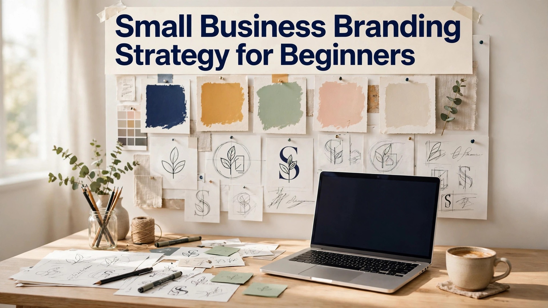
A small business branding strategy for beginners is not a mystery, and it is not a luxury. It is a set of decisions, made once and repeated daily, that make a small business look bigger, more trustworthy, and easier to remember than its size suggests. A bakery with a clear brand will outsell a bakery with better bread and no brand, because customers buy the business they remember, not only the product they taste.
Most beginners think branding means a logo. A logo is one piece, and it is not the most important one. Branding means the name, the colours, the voice, the photos, and the experience, all working together so a customer recognises the business in a second. This guide covers the full strategy, from the positioning to the logo, the colours, the voice, and the launch, in plain language a beginner can follow.
A brand is a promise, and a small business keeps it every day. The promise is what the customer can expect, whether they visit the shop, open the website, or see a post on social media. A business that keeps its promise builds trust, and trust builds repeat customers. A business that breaks its promise, with a different look and a different voice every week, will lose customers it never knew it had.
Quick jump
- Quick Answer. A Branding Strategy in 30 Seconds
- Small Business Branding Strategy for Beginners in 6 Steps
- Positioning, Naming and the One-Sentence Promise
- Logo, Colours and Fonts for a Beginner Brand
- Voice, Story and the Customer Experience
- Launching the Brand, Telling the Story and Staying Consistent
- Budget, Tools and the Beginner Brand Kit
- Mistakes That Weaken a Beginner Brand
- A Worked Example, a Bakery Brand from Scratch
- Related Guides
- Frequently Asked Questions
- The Bottom Line
Quick Answer. A Branding Strategy in 30 Seconds
A small business branding strategy for beginners comes down to five decisions. Who the business serves, what makes it different, what it is called, what it looks like, and how it speaks. Answer those five questions in one page, build a brand kit from the answers, and use the kit on every post, card, and page. Canva Pro, at $18 a month or $144 a year, holds the brand kit and the templates. Looka, at $72 one-time for a Premium logo package, builds the logo and the kit files.
The strategy needs five things. A positioning line, a name that fits, a logo in three versions, three colours, and a voice with three words. The rest of this guide proves that short answer, with the positioning, the naming, the design, and the launch steps in order.
| Brand element | Beginner decision | What good looks like |
|---|---|---|
| Positioning | Who you serve, and why you are different | One sentence a customer can repeat |
| Name | Short, memorable, easy to spell | A name that fits the promise |
| Logo | Primary, monochrome, and icon versions | A logo readable at small size |
| Colours | One primary, two supporting, one accent | Three colours used everywhere |
| Voice | Three tone words, with examples | A voice that sounds like one person |
Small Business Branding Strategy for Beginners in 6 Steps
Step one is the customer. Write down who the business serves, in one sentence. A bakery that serves busy parents in Manchester is a different business from a bakery that serves wedding couples across the country. The customer decides the brand, because the brand must speak to them, not to everyone. A brand that tries to speak to everyone will speak to no one, and a brand that speaks to one customer clearly will be heard.
Step two is the difference. Write down what makes the business different from the three nearest competitors, in one sentence. The difference can be the product, the service, the price, or the experience, but it must be real, and it must matter to the customer. A bakery that bakes sourdough every morning is different from a bakery that sells frozen bread. A plumber who answers the phone in one ring is different from a plumber who never answers. The difference is the reason a customer chooses you, and the brand must state it clearly.
Step three is the positioning line. Combine the customer and the difference into one sentence that a customer can repeat. Fresh sourdough every morning, for busy Manchester parents. A plumber who answers, fixes, and guarantees, for landlords across the city. A positioning line is not a slogan for an advert. It is a sentence the business uses to decide what to do, what to say, and what to sell. A business with a clear positioning line will make better decisions than a business without one.
Step four is the name and the look. Choose a name that fits the positioning, that is short, memorable, and easy to spell, and check that the domain and the social handles are available. Then build the look, with a logo, three colours, and two fonts, in a brand kit. The look should feel like the positioning, so a warm, friendly business looks warm and friendly, and a precise, professional business looks precise and professional. A look that fights the positioning will confuse customers.
Step five is the voice. Choose three words that describe how the business speaks, such as warm, honest, and practical, or bold, playful, and direct. Write two example lines for each word, so anyone writing for the business can match the voice. A voice that is written down will be used. A voice that lives in the owner’s head will be forgotten the first time someone else writes a post.
Step six is the launch. Apply the brand to every place the business appears, from the website to the social profiles, the business cards, the invoices, and the shop sign. Announce the brand with a clear story, such as why the business exists and who it serves, and keep using the kit on every post, card, and page. A brand launched everywhere at once will be recognised fast. A brand launched in one place and forgotten in another will confuse customers.
Positioning, Naming and the One-Sentence Promise
Positioning is the most important branding decision, and it is the one beginners skip. Getting it right is the foundation of any small business branding strategy for beginners that actually works. Positioning answers two questions. Who is the business for, and why should they choose it over the alternatives. A business that cannot answer those questions in one sentence does not have a brand. It has a product, and a product without a position will be compared on price alone, which is a race to the bottom.
The customer should be specific. A business for everyone is a business for no one, because a message written for everyone will be read by no one. A business for busy parents, for first-time buyers, for landlords, or for wedding couples is a business with a customer it can picture, and a brand it can build for that person. Specificity is not limiting the business. It is focusing it, and a focused business will grow faster than a vague one.
The difference should be real and provable. A claim such as the best bakery in town is not a difference, because every bakery claims it and no customer can verify it. A claim such as baked fresh every morning at 5 am, with the ovens visible from the counter, is a difference, because a customer can see it and taste it. A difference that can be proved will be believed. A difference that cannot be proved will be ignored.
The name should fit the positioning, and it should be easy to say, spell, and remember. A name that is hard to spell will be hard to find, and a name that is hard to say will be hard to recommend. Check the domain, the social handles, and the trademark, before you commit, because a name that cannot be used online is a name that cannot be found. A name that passes all three checks is a name worth keeping.
The one-sentence promise is the test of the whole strategy. If the business cannot state its promise in one sentence, the strategy is not finished. A promise such as fresh bread every morning, for the neighbours who walk past our door, is a strategy. A promise such as quality products and excellent service is not, because it could describe any business in any industry. The sentence should be specific enough that a competitor could not say the same thing, and simple enough that a customer can repeat it.
Logo, Colours and Fonts for a Beginner Brand
The logo is the face of the brand, and it should be simple, memorable, and readable at small size. That simplicity is a rule every small business branding strategy for beginners should follow. A logo with a clear mark, a clean wordmark, and no more than two colours will work on a shop sign, a business card, and a social avatar. A logo with five colours, a detailed illustration, and a long name will fail at small size, because the detail will blur into noise. A simple logo that can be drawn from memory is a strong logo. A complex logo that needs a designer to explain it is a weak one.
The logo needs three versions. The primary logo, in full colour, for the website and the shop sign. A monochrome version, in one colour, for stamps, receipts, and single-colour print. And an icon on its own, for social avatars and favicons, where the full logo would be unreadable. A logo with only one version will be misused, because it will be stretched, cropped, or placed on a background where it cannot be read. Three versions, kept in one folder, will be used properly.
Colours should follow the positioning. A warm, friendly business suits warm colours, such as terracotta, cream, and brown. A precise, professional business suits cool colours, such as navy, teal, and white. A playful business suits bright colours, such as coral, yellow, and turquoise. The colours should feel like the business, because a customer will judge the business by its colours before they read a word. Three colours plus one accent is the right number, because more colours will make every post look different.
Fonts should be two, not more. One for headings, with personality, and one for body text, that is readable at small sizes. Free fonts from Google Fonts, such as Inter, Poppins, and Playfair Display, cover most small businesses well. A heading font that suits the brand will feel right to the customer, even when they cannot name why. A body font that is hard to read will make the customer leave, however good the words are.
The brand kit holds all of this in one place. The logo files, the colour codes in hex, RGB, and CMYK, the font names, and a one-page rules sheet that states where the logo goes, how much space to leave around it, and what never to do. A brand kit built in Canva Pro, at $18 a month or $144 a year, will lock the colours and fonts, so the team cannot drift. A brand kit that lives in a shared folder, with clear names, will be used. A brand kit that lives on one person’s laptop will be lost.

Voice, Story and the Customer Experience
Voice is how the brand speaks, and it matters as much as how it looks. A small business branding strategy for beginners that ignores voice will produce a brand that looks right and sounds wrong. A brand with a clear voice will sound like one person, whether the words are on a website, a social post, or a reply to a customer. A brand with no voice will sound like a different person every time, and customers will not trust it, because they will not know who they are dealing with. Choose three tone words, such as warm, honest, and practical, and write two example lines for each, so anyone writing for the business can match the voice.
The story is the reason the business exists, told in three sentences. A story such as we started baking because our street had no fresh bread, and we bake every morning so our neighbours never go without, is a story a customer can remember and repeat. A story that lists the business history in ten paragraphs will be skipped. The story belongs on the About page, in the bio, and in the first conversation with a new customer, because a story is what makes a business human.
The customer experience is the brand in action. The way the phone is answered, the way the shop looks, the way the order is packed, and the way a complaint is handled are all branding, because they are the moments a customer remembers. A brand that promises warmth and answers the phone coldly has broken its promise, and the customer will not return. A brand that promises precision and delivers late has broken its promise too. The experience must match the words, or the words are lies.
Every touchpoint should carry the brand. The website, the social profiles, the business cards, the invoices, the packaging, and the email signature should all use the same logo, colours, and voice. A customer who sees the same brand everywhere will trust it, because consistency feels like care. A customer who sees a different brand in each place will doubt it, because inconsistency feels like neglect. A brand audit, once a year, will find the places where the brand has drifted, and fix them before customers notice.
Launching the Brand, Telling the Story and Staying Consistent
The launch should be a moment, not a quiet change, and planning it is the final step in a small business branding strategy for beginners. Announce the brand with a story, on social media, on the website, and in the shop, explaining why the business exists, who it serves, and what makes it different. A launch that tells a story will be remembered. A launch that changes the logo with no explanation will be ignored, because customers will not know what changed or why it matters.
The story should be told in the brand’s voice, with the brand’s colours and photos, so the launch itself demonstrates the brand. A launch post in the new colours, with the new logo and a short story, will show customers what the brand looks like, while telling them what it means. A launch that uses the old colours and the old voice will confuse customers, because the message and the medium will disagree.
Consistency after launch is the habit that makes the brand work. Use the brand kit on every post, card, and page, and check the brand once a month, by opening the website, the social profiles, and a recent invoice side by side. If they look like one business, the brand is working. If they look like three businesses, the brand has drifted, and the kit needs to be reapplied. A monthly check takes five minutes, and it is the habit that keeps a brand consistent.
Train the team, even if the team is two people. Show them the rules sheet, walk them through the templates, and explain why the logo never gets stretched and why the blue never changes. People follow rules they understand, and they ignore rules that arrive as a PDF with no explanation. A five-minute conversation saves fifty corrections later, and it makes the team feel like part of the brand, not like workers following orders.
Budget, Tools and the Beginner Brand Kit
A beginner brand can cost nothing, or it can cost a few hundred dollars, and both routes can work. A free brand, built with Canva’s free plan, Google Fonts, and a free logo from LOGO.com, will look professional if the decisions are clear and the kit is used consistently. A paid brand, with a Looka Premium logo package at $72 one-time, or a designer-made logo from Fiverr, will look more original, and it is worth the cost for a business that can afford it. The price of the brand matters less than the clarity of the decisions behind it.
The tools a beginner needs are few. Canva for the brand kit and the templates, Google Fonts for the type, and a shared folder for the files. Canva Pro, at $18 a month or $144 a year, adds brand kits with locked colours and fonts, and premium templates. Adobe Express Premium, at $9.99 a month, adds Adobe Fonts and stock. Looka, at $72 one-time for Premium, adds the logo files and a brand kit. A beginner should start with the free tools, and pay only when the free tools limit the work.
The brand kit is the deliverable of the whole strategy. It should contain the logo in three versions, the colour codes, the font names, the voice words with examples, and the one-page rules sheet. A kit that fits on one page of rules and one folder of files will be used. A kit that needs a forty-page brand book will be filed and forgotten. A beginner brand kit should be simple, clear, and shared with everyone who touches the brand.
Review the brand once a year. A business changes, and the brand should change with it. A new product, a new audience, or a new shop can all justify a refresh, with one element changed at a time, so the brand stays recognisable while it evolves. A brand that never changes becomes a museum piece, and a brand that changes every week is not a brand at all. An annual review, with the team, will keep the brand alive and honest.

Mistakes That Weaken a Beginner Brand
The first mistake is copying a competitor. A brand that looks like the business across the street will be confused with it, and customers will choose the original over the copy. The fix is the positioning step, with a difference that is real and provable, and a look that follows from it. A brand that is different will be remembered. A brand that copies will be forgotten.
The second mistake is too many colours and fonts. A brand with eight colours and four fonts is not a brand, it is a box of crayons, and every post will look different. The fix is three colours plus one accent, and two fonts, locked in the brand kit. A brand with few elements, used consistently, will look more professional than a brand with many elements, used randomly.
The third mistake is a logo that cannot be read at small size. A detailed logo with a long name will blur into noise on a social avatar, and customers will not recognise it. The fix is a simple logo, with a clear mark and a short name, tested at avatar size before it is approved. A logo that reads at small size will work everywhere. A logo that does not will fail everywhere it matters.
The fourth mistake is a voice that changes with the mood. A post that is warm on Monday and formal on Wednesday will confuse customers, because they will not know who the business is. The fix is the three voice words, written down with examples, and used on every post. A voice that is written down will be used. A voice that lives in the owner’s head will be forgotten.
The fifth mistake is launching the brand and forgetting it. A brand that is launched with fanfare and then ignored will drift, with the colours changing, the fonts changing, and the voice changing, until the business looks like three businesses. The fix is the monthly check, with the website, the social profiles, and a recent invoice side by side. A brand checked monthly will stay consistent. A brand never checked will decay.

A Worked Example, a Bakery Brand from Scratch
A bakery in Manchester serves busy parents who walk past the shop on the school run. Its difference is sourdough baked fresh every morning at 5 am, with the ovens visible from the counter. Its positioning line is fresh sourdough every morning, for the parents on the school run. The name is Morning Crumb, short, memorable, and easy to spell, with the domain and the social handles available. The colours are terracotta, cream, and brown, with a warm accent for the price tags. The fonts are Playfair Display for headings and Inter for body text. The voice words are warm, honest, and practical, with example lines such as baked this morning, still warm, and no shortcuts, ever.
The logo is a simple wheat mark above the name Morning Crumb, in terracotta on cream, with a monochrome version in brown and an icon of the wheat mark on its own. The brand kit holds the three logo versions, the colour codes, the font names, and a one-page rules sheet. The templates are five, for a post, a story, a price announcement, a customer quote, and a new product, all in the palette and the fonts. The website header carries the logo, the headings use Playfair Display, and the buttons use the terracotta accent. The shop sign, the bags, and the invoices all carry the same brand.
The launch is a Saturday morning, with free samples of the morning bake, a story on social media about why the bakery started, and a loyalty card in the new colours. The first month is measured by footfall, by loyalty cards issued, and by social follows, and the review at the end of the month keeps the pillars that worked and fixes the ones that did not. A year later, Morning Crumb is the bakery parents recommend to new neighbours, not because its bread is the only good bread in Manchester, but because its brand is the one they remember.
Related Guides
- AI Logo Generator Pricing
- How to Create a Brand Kit for Your Small Business
- How to Make a Business Logo with AI
Frequently Asked Questions
What is a branding strategy for a small business?
A branding strategy is a set of decisions about who the business serves, what makes it different, what it is called, what it looks like, and how it speaks. Those decisions are written down in a brand kit, with a logo, colours, fonts, and voice rules, and they are used on every post, card, and page. A strategy turns a logo into a brand that customers recognise and trust.
How much does branding cost for a small business?
A beginner brand can cost nothing, using Canva’s free plan, Google Fonts, and a free logo, or it can cost $72 one-time for a Looka Premium logo package, or a few hundred dollars for a designer-made logo. Canva Pro costs $18 a month or $144 a year. The price matters less than the clarity of the decisions, because a free brand used consistently will outperform an expensive brand that nobody follows.
How do I choose brand colours?
Choose colours that feel like the positioning, with one primary colour, two supporting colours, and one accent for buttons and calls to action. A warm business suits warm colours, a precise business suits cool colours, and a playful business suits bright colours. Test the palette on a real post, a business card, and an invoice header before you commit, and check the contrast for readability.
Do I need a logo to have a brand?
A logo helps, but a brand is more than a logo. A brand is the positioning, the name, the colours, the voice, and the experience, all working together. A business with a simple wordmark, clear colours, and a consistent voice has a brand, even without a complex logo. A business with a beautiful logo and no positioning, no voice, and no consistency does not have a brand, however good the logo looks.
How do I keep my brand consistent?
Build a brand kit with the logo, colours, fonts, and voice rules, lock them in your design tool, and use templates built from the kit, so the right choices are the easy choices. Check the brand monthly, by opening the website, the social profiles, and a recent invoice side by side, and train the team on the rules sheet. A brand checked monthly will stay consistent.
Can I rebrand my small business later?
Yes. A business can refresh its brand once a year, changing one element at a time, so the brand stays recognisable while it evolves. A new product, a new audience, or a new shop can all justify a refresh. A rebrand that changes everything at once will confuse customers, so change one thing, such as the accent colour or the headline style, and keep the rest.
The Bottom Line
A small business branding strategy for beginners is five decisions, made once and repeated daily, and this guide has walked through each of them in order. Who the business serves, what makes it different, what it is called, what it looks like, and how it speaks. Answer those questions in one page, build a brand kit from the answers, and use the kit on every post, card, and page.
The businesses customers remember are not the ones with the most beautiful logo. They are the ones that look the same everywhere, sound like one person, and keep their promise every day. A brand is a promise, and a small business that keeps it will grow bigger than its size suggests.
1 thought on “Small Business Branding Strategy for Beginners”