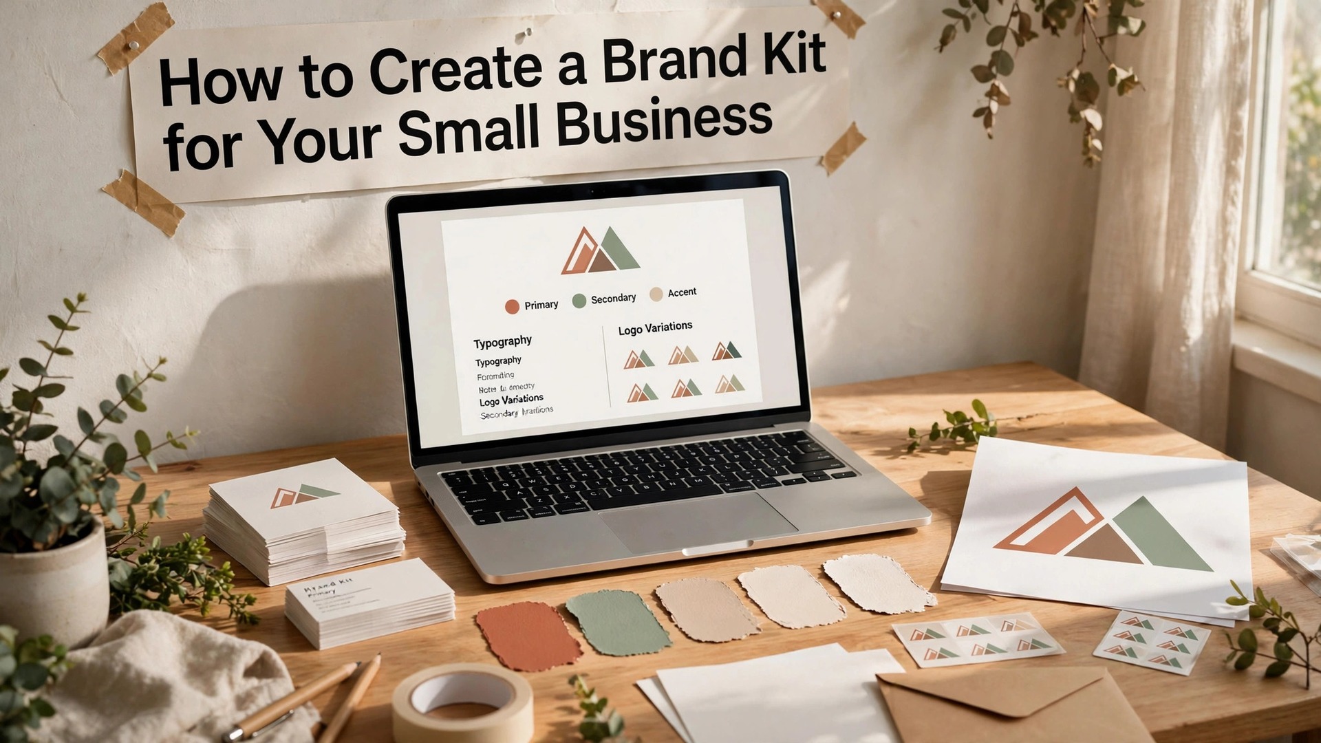
Learning how to create a brand kit for your small business is the step that turns a logo into a brand. A logo on its own is a picture. A brand kit is a system, with the logo, the colours, the fonts, and the rules that keep every post, card, and invoice looking like they came from the same business.
Most small businesses skip this step, and the result shows. The Instagram posts use one shade of blue, the website uses another, the business card uses a third, and customers cannot tell at a glance that all three belong to the same shop. A brand kit fixes that in an afternoon, and it costs little or nothing to build. This guide walks through the full process, from choosing colours to writing the one-page rules sheet your whole team can follow.
A brand kit is not a luxury for big companies. It is a time saver for small ones. Once the kit exists, making a social post takes minutes instead of an hour, because the colours, fonts, and logo files are already decided. New staff, freelancers, and designers can all work from the same kit, and the business starts to look bigger and more consistent than its size suggests.
In this article
- Quick Answer. A Brand Kit in 30 Seconds
- How to Create a Brand Kit for Your Small Business in 6 Steps
- Choosing Colours That Customers Remember
- Fonts, Logo Files and the Rules That Hold Them Together
- Canva, Adobe Express and Looka for Brand Kits
- Templates That Keep Every Post on Brand
- Using the Brand Kit Across Social, Print and Your Website
- Mistakes That Break a Brand Kit
- How to Create a Brand Kit for Your Small Business on a Zero Budget
- Related Guides
- Frequently Asked Questions
- The Bottom Line
Quick Answer. A Brand Kit in 30 Seconds
Knowing how to create a brand kit for your small business comes down to five decisions. One logo in three versions, two fonts, three colours, a set of image rules, and a one-page guide that writes down how they all fit together. Canva Pro, at $18 a month or $144 a year, holds up to five brand kits with locked fonts, colours, and logos. Adobe Express Premium, at $9.99 a month, offers brand kits with Adobe Fonts and stock. Looka and LOGO.com sell one-time logo packages that include brand kit files.
Start with the logo you already have, even if it is simple. A brand kit built around a simple logo that you use everywhere beats a beautiful logo that appears in a different form on every page. The rest of this guide proves that short answer, with the colour, type, logo, and template steps in order.
| Kit element | What to decide | Where it lives |
|---|---|---|
| Logo | Primary, monochrome, and icon versions | Logo folder, PNG and SVG |
| Colours | One primary, two supporting, one accent | Colour codes in hex, RGB, and CMYK |
| Fonts | One heading font, one body font | Font files or Google Fonts links |
| Imagery | Photo style, filters, and what to avoid | Example images in the guide |
| Voice | Three tone words and example lines | One-page rules sheet |
How to Create a Brand Kit for Your Small Business in 6 Steps
Step one is the audit. Gather every place your business already appears, from the Instagram profile to the invoice template, and lay them side by side. The gaps will be obvious. Three blues, two fonts, a logo cropped differently on each page. Write down what you like and what embarrasses you, because the audit is the brief for the kit.
Step two is the logo set. You need three versions of your logo. The primary logo, in full colour, for the website header and the shop sign. A monochrome version, in one colour, for stamps, receipts, and single-colour print. And an icon or mark on its own, for social avatars and favicons, where the full logo would be unreadable. If your logo has no icon version, crop the strongest part of it, or ask a designer for a simplified mark.
Step three is the colour palette. Pick one primary colour that carries the brand, two supporting colours that sit beside it, and one accent colour reserved for buttons and calls to action. Write down the hex code, the RGB values, and the CMYK values for each, because a designer, a printer, and a website each need a different format. Test the palette on a real post before you lock it in.
Step four is the typography. Choose one font for headings and one for body text. The heading font can have personality, while the body font must be readable at small sizes. Free options from Google Fonts, such as Inter, Poppins, and Playfair Display, cover most small businesses well. Check that both fonts include bold and regular weights, and that they work in the languages your customers read.
Step five is the imagery. Decide what your photos look like. Bright and warm, or clean and minimal. Real photos of your work, your team, and your products, not stock photos of strangers in offices you will never visit. Write two lines about the photo style, and save five example photos in the kit folder so anyone making a post can match the look.
Step six is the rules sheet. Write one page that explains the kit in plain words. Where the logo goes, how much space to leave around it, which colours go together, which fonts to use, and what never to do. A rules sheet that fits on one page gets read. A brand book of forty pages gets filed and forgotten.
Choosing Colours That Customers Remember
Colour is the fastest signal a brand sends, because the eye reads colour before it reads words. A customer scrolling a feed recognises your blue before they read your name, which is why the palette must stay consistent. Changing the blue every month breaks that recognition, and recognition is the whole point of a brand.
Start with the feeling you want, not with a favourite colour. A bakery wants warmth, so cream, terracotta, and brown work well. A tech repair shop wants trust, so navy, teal, and white work well. A children’s party business wants energy, so coral, yellow, and turquoise work well. The feeling comes first, and the specific shades follow from it.
Test the palette in real use before you commit. Build one Instagram post, one business card, and one invoice header in the new colours, and look at all three together. The colours must work as a set, not only as single swatches. A palette that looks good in a colour picker can fail on a real card, because the proportions change everything. A strong colour used sparingly looks confident. The same colour used everywhere looks loud.
Accessibility is part of the decision, not an afterthought. Check that your body text colour has strong contrast against its background, because light grey text on white fails for older readers and for anyone reading in sunlight. Free contrast checkers online will give you a pass or fail in seconds, and a palette that passes is a palette every customer can read.
Write the codes down in every format. Hex codes for the website and social posts, RGB for screens, CMYK for print, and Pantone numbers if your printer asks for them. A colour that exists only in your head will be a different colour on every screen, and the kit exists to stop exactly that drift.
Fonts, Logo Files and the Rules That Hold Them Together
Two fonts are enough for almost every small business. One for headings, one for body text. A third font for accents, such as a script for a bakery or a mono font for a tech brand, is the maximum, and most businesses should stop at two. Every extra font adds noise, and noise is the enemy of a recognisable brand.
The heading font carries the personality. A serif heading font feels traditional and trustworthy, which suits a law firm, a jeweller, or a heritage bakery. A bold sans serif heading feels modern and direct, which suits a gym, a tech shop, or a delivery business. The body font must be invisible in the best sense, which means a clean sans serif that reads easily at 11 points and on a phone screen.
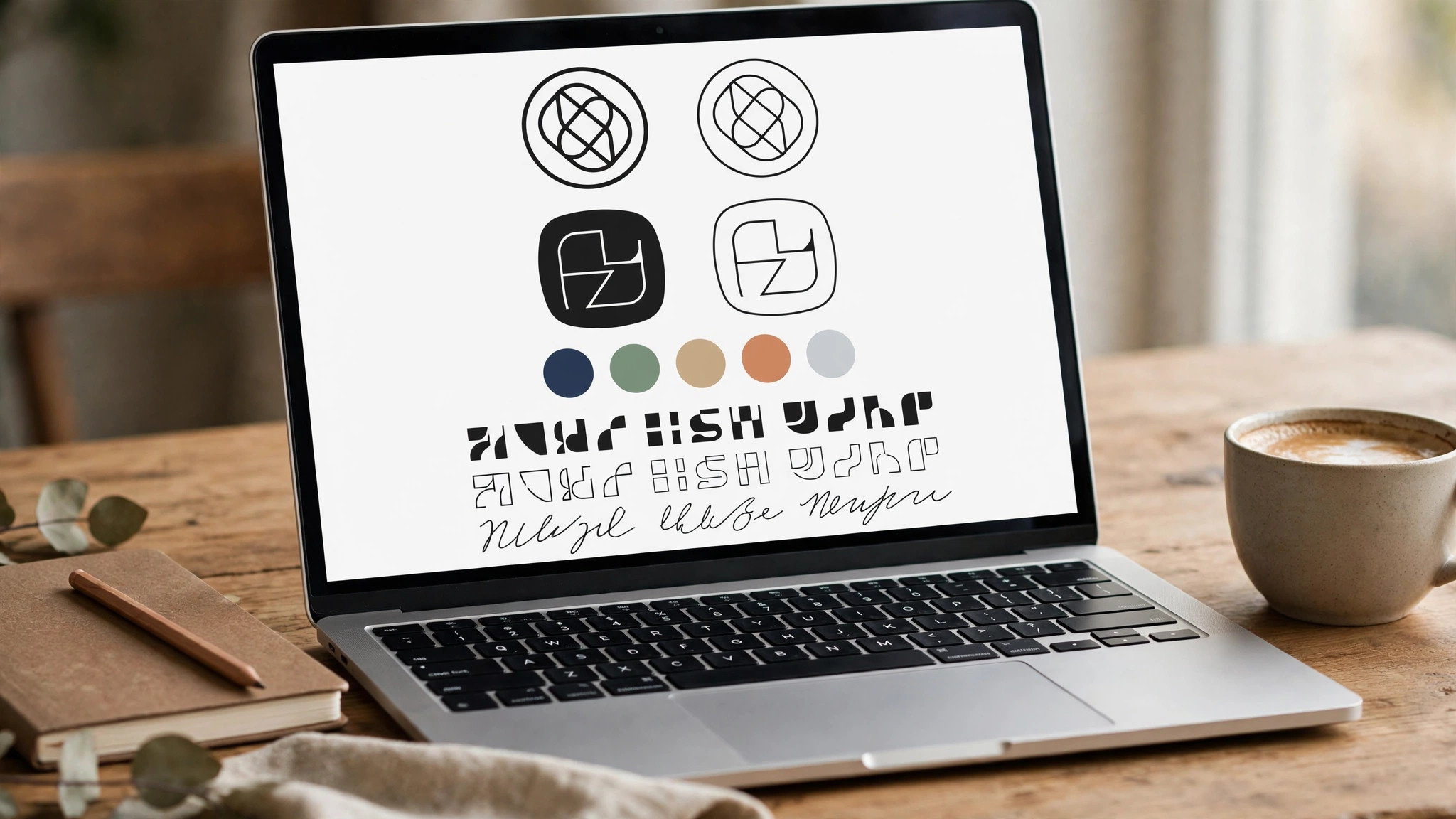
Logo files need the same discipline as colours. Keep the master files in a single folder, with clear names. Logo primary in colour, in PNG and SVG. Logo in white, for dark backgrounds. Logo in black, for single-colour print. Logo icon on its own, for avatars. A logo saved as a low-resolution JPG with a white background baked in is the most common brand kit failure, because it cannot sit on a coloured background without a white box around it.
The rules sheet is where the kit becomes usable. Write the rules as plain instructions, not as design theory. The logo always sits in the top left. Leave space around the logo equal to the height of its first letter. Never stretch the logo, never add a drop shadow, never place it on a busy photo. Headings are always in the heading font, in the primary colour, at 24 points or larger. Body text is always in the body font, in dark grey, never in pure black on a white page, because pure black feels harsh.
One page of rules is enough. Print it, pin it above the desk where posts are made, and share it with every freelancer and designer who touches the brand. A kit that lives in a folder nobody opens is not a kit. It is a wish.
Canva, Adobe Express and Looka for Brand Kits
Canva is the most practical home for a small business brand kit. Canva Pro, at $18 a month or $144 a year, stores up to five brand kits, each with its own logos, colours, and fonts, and the editor applies them in one click. The free plan stores one brand kit with three colours, which is enough to start. The magic of Canva brand kits is the lock, because a template built from the kit cannot drift into the wrong blue by accident.
Adobe Express Premium, at $9.99 a month, offers brand kits with Adobe Fonts, premium stock, and 100 GB of storage. Its brand kit tools are simpler than Canva, but its font range is deeper, which matters for a business whose heading font is the heart of its look. Adobe Express suits a business that already uses Adobe tools, or one that wants a photographic, polished style.
Looka builds a brand kit from a logo. Its Premium package costs $72 one-time and buys the logo files in PNG, EPS, SVG, and PDF, with full ownership. Its Brand Kit plan costs $96 a year and adds more than 300 matching templates for business cards, social posts, email signatures, and invoices. Looka suits a new business that needs a logo and a kit in one purchase, rather than a business that already has a logo it likes.
LOGO.com offers a free logo download with a commercial licence, and its Brand Plan costs $1 a month for three months, then $15 a month, adding SVG files, more than 250 high-resolution files, and 1,200 templates. It is the cheapest route to a full brand kit, and it suits a business with no budget at all. The trade is originality, because free icons come from shared libraries, so the logo may look familiar.
For a business that wants a designer-made kit, Fiverr and Upwork offer brand kit packages from independent designers, usually starting from a few dozen dollars. Ask for the logo in SVG, the colour codes in hex and CMYK, and the fonts named, not only shown in a picture. A kit delivered as a single JPG image is not a kit, because nothing in it can be reused.
Templates That Keep Every Post on Brand
A brand kit without templates is a set of good intentions. Templates are where the kit does its daily work. Build five templates before you worry about anything else. One for an Instagram post, one for a story, one for a price or promotion announcement, one for a customer quote, and one for a new product. Five templates cover most of a small business’s week.
Each template should carry the kit in its bones. The logo sits in the same place every time. The headline uses the heading font and the primary colour. The body text uses the body font. The accent colour appears once, on the button or the price. A customer who sees three of your posts in a week should feel the same business behind all three, even before reading the words.
Build the templates in the tool you actually use. If your team works in Canva, build them in Canva and share the folder. If your designer works in Adobe Express, build them there. A template in a tool nobody opens is a template that does not exist. Keep the templates in one shared folder, with names a new team member can understand, such as Instagram post, Story, Price announcement, Customer quote, and New product.
Leave room in every template for a photo. A template that is all text and colour will feel empty when a real photo arrives, and a template with no photo space will be abandoned the first time a product needs showing. The photo area should be the largest element, because a real photo of your work is the most convincing thing a small business can post.
Review the templates every three months. A template that felt fresh in January can feel tired by June, and a small refresh, such as a new accent colour or a new headline style, keeps the feed alive without breaking the brand. Change one thing at a time, so the brand stays recognisable while it evolves.
Using the Brand Kit Across Social, Print and Your Website
Social media is where the kit earns its keep daily. Set the profile picture to the icon version of the logo, and set the bio in the brand voice, with the same words your rules sheet uses. Every post should use the template, the fonts, and the colours, so the feed looks like one business instead of ten. A feed with a consistent look gains followers faster, because people follow accounts they recognise.
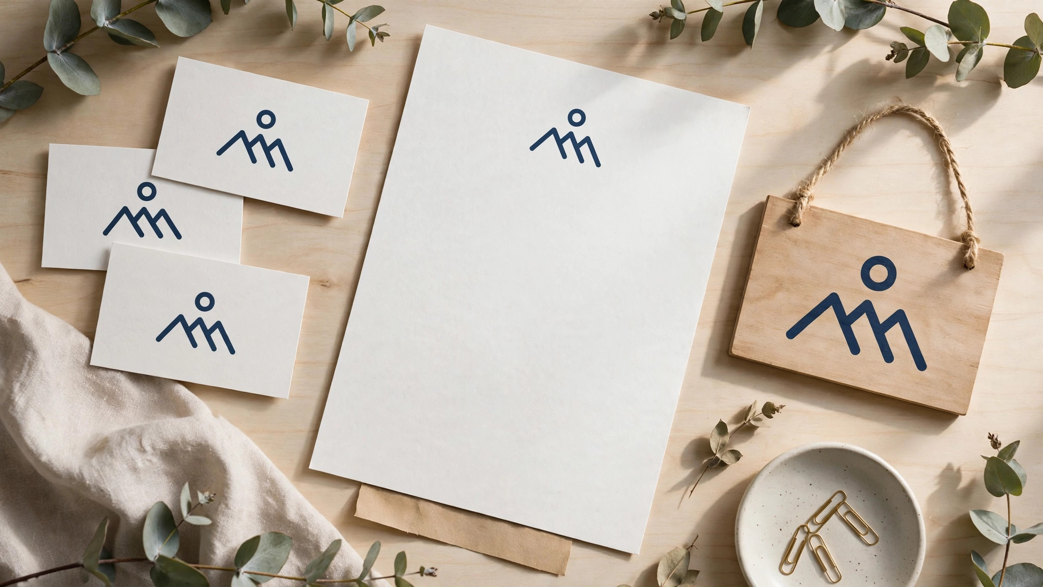
Print is where the kit proves its value, because print cannot be fixed after the fact. Business cards, flyers, menus, and invoices should all carry the same logo, colours, and fonts. A customer who takes a business card and later visits the website should feel they have arrived at the same place. If the card is teal and the website is purple, the customer wonders whether they have the right business.
The website is the home of the brand. The header carries the primary logo, the headings use the heading font, and the buttons use the accent colour. A website built from the kit looks deliberate, even when it is a simple template site. A website that ignores the kit looks like a different business that happens to share the name.
Email is the quiet channel where brands drift most. Set the email signature to the logo and the brand colours, and build the newsletter template from the kit. A newsletter that looks like your Instagram feed builds trust, because the reader recognises the sender before reading the subject line. A plain email from a branded business feels like a stranger wrote it.
Train the team, even if the team is two people. Show them the rules sheet, walk them through the templates, and explain why the logo never gets stretched and why the blue never changes. This training is the part of how to create a brand kit for your small business that most owners skip, and it is the part that decides whether the kit survives its first month. People follow rules they understand, and they ignore rules that arrive as a PDF with no explanation. A five-minute conversation saves fifty corrections later.
Mistakes That Break a Brand Kit
The first mistake is too many colours. A kit with eight colours is not a palette, it is a box of crayons, and every post will use a different combination. Three colours plus one accent is enough for almost every small business. If you need more, add tints of the same colours, not new colours.
The second mistake is a logo with no clear space. A logo crowded by text, photos, or the edge of the page looks accidental. The rules sheet should state the clear space plainly, such as the height of the first letter on every side, and every template should respect it. Clear space is what makes a logo look confident instead of cramped.
The third mistake is fonts that change with the mood. A post in one font on Monday and a different font on Wednesday tells customers the business has no system. Lock the fonts in the tool you use, and remove the other fonts from the template so nobody can pick them by accident.
The fourth mistake is a kit that nobody can find. A brand kit stored on one person’s laptop, in a folder named final final v2, is lost the day that person is away. Store the kit in a shared folder, with clear names, and tell the whole team where it lives. A shared drive, a Canva brand kit, or an Adobe Express library all work, as long as everyone knows the address.
The fifth mistake is never updating the kit. A business changes, and the kit should change with it. A new product line, a new shop, or a new audience can all justify a refresh. Review the kit once a year, change what no longer fits, and tell the team what changed. A kit that never changes becomes a museum piece, and a kit that changes every week is not a kit at all.
How to Create a Brand Kit for Your Small Business on a Zero Budget
A brand kit with no budget starts with free tools and honest choices. Canva’s free plan stores one brand kit with three colours, which is enough for the palette this guide recommends. Google Fonts gives you hundreds of free fonts, including Inter, Poppins, and Playfair Display, with commercial use included. LOGO.com gives you a free logo download with a commercial licence. Those three free tools cover the logo, the colours, and the fonts, which are the heart of the kit.
The logo is the hardest part on a zero budget, because a free logo can look familiar. Work around that by keeping the logo simple. A clean wordmark, which is your business name in a strong font with one small mark, looks more professional than a complicated free icon. Choose a font with character, set the name in the primary colour, and add a simple shape, such as a dot, a line, or a leaf, that you can repeat across the brand. A simple wordmark you own is better than a detailed free logo that a hundred other businesses also use.
Colour costs nothing, so spend real time on it. Use a free palette tool such as Coolors or Adobe Color to test combinations, and check the contrast of every pair before you commit. A palette built from free tools and tested on real posts is as good as a palette built by a designer, because the test is what matters, not the price of the tool that picked the colours.
Fonts are free too, and the choice matters more than the price. Pick a heading font with personality and a body font that disappears, and download both from Google Fonts so every team member has the same files. Avoid fonts that only exist on one computer, because a font that lives on the owner’s laptop cannot be used by anyone else. A shared font folder, with the two font files and a text file naming them, is part of the kit.
Templates are the last free piece. Build five templates in Canva’s free plan, using the brand kit colours and fonts, and share the folder with the team. A template for a post, a story, a price announcement, a customer quote, and a new product covers the week. When the business can afford Canva Pro, the same templates move across with one click, and the kit grows without being rebuilt.
The zero-budget kit has one rule that matters more than any other. Use it everywhere, from the first day. A free kit used on every post beats an expensive kit that sits in a folder, because consistency is the product, not the price tag. Customers remember the business that looks the same every time they see it, and that recognition costs nothing to earn.
Related Guides
- How to Make a Business Logo with AI
- How to Rebrand Your Small Business
- Small Business Branding Strategy for Beginners
Frequently Asked Questions
What should a brand kit include?
A brand kit should include the logo in three versions, the colour palette with hex, RGB, and CMYK codes, two fonts, image style rules, and a one-page rules sheet. Those five elements cover every post, card, and page a small business makes. Anything more is useful later, but these five are the core.
How much does a brand kit cost?
A brand kit can cost nothing, using Canva’s free plan and Google Fonts, or it can cost $72 one-time for a Looka Premium logo package with brand files. Either way, the real cost of how to create a brand kit for your small business is an afternoon of decisions, not a large budget. Canva Pro costs $18 a month or $144 a year, and Adobe Express Premium costs $9.99 a month. A designer-made kit from a freelancer usually starts from a few dozen dollars.
Can I make a brand kit for free?
Yes. Canva’s free plan stores one brand kit with three colours, and Google Fonts are free to use. LOGO.com gives a free logo download with a commercial licence. A free kit built carefully and used consistently will outperform an expensive kit that nobody opens.
How many colours should a brand kit have?
Three colours plus one accent is the right number for most small businesses. One primary colour carries the brand, two supporting colours sit beside it, and the accent colour is reserved for buttons and calls to action. More colours than that make every post look different.
How do I keep my team using the brand kit?
Store the kit in a shared folder everyone can reach, lock the colours and fonts in your design tool, and build templates from the kit so the right choices are the easy choices. A five-minute walkthrough of the rules sheet, and a reminder when someone drifts, keeps the kit alive.
Do I need a brand kit if I only sell on social media?
Yes, more than most businesses, because social media is where inconsistency shows fastest. A feed where every post uses the same colours, fonts, and logo looks like a real business, while a feed that changes style every week looks like a hobby. A brand kit is what turns a feed into a shopfront.
The Bottom Line
Knowing how to create a brand kit for your small business is an afternoon of decisions that pays off every day after. One logo in three versions, three colours plus an accent, two fonts, a photo style, and a one-page rules sheet. Build it in Canva or Adobe Express, store it where the whole team can reach it, and use it on every post, card, and page.
The businesses customers remember are not the ones with the most beautiful logo. They are the ones that look the same everywhere, so customers recognise them in a second. That recognition is the real return on learning how to create a brand kit for your small business, and it compounds with every post, card, and page that follows the kit. A brand kit is how a small business earns that recognition, and it starts with the five decisions in this guide.
1 thought on “How to Create a Brand Kit for Your Small Business”