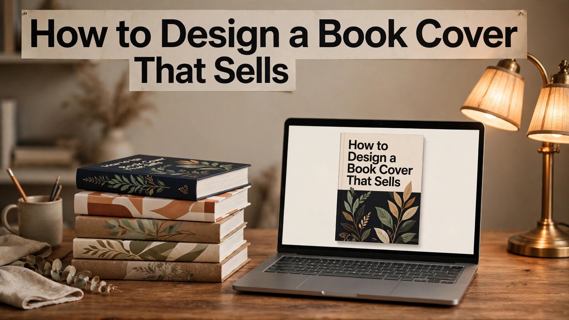
Learning how to design a book cover that sells starts with a hard truth. Readers judge a book by its cover, in about three seconds, on a screen the size of a playing card. A cover that looks professional earns a click. A cover that looks amateur earns a scroll past, and the book inside never gets a chance, however good it is.
The cover is not decoration. It is the book’s advertisement, its shop window, and its first review, all in one image. It must tell the reader the genre, the tone, and the promise of the book, in a single glance. This guide covers the full process, from the genre rules to the typography, the imagery, the tools, and the print and ebook sizes.
A cover that sells is not the most beautiful cover. It is the cover that looks like it belongs in its genre, that reads clearly at thumbnail size, and that makes the right reader stop scrolling. A romance cover that looks like a thriller will attract the wrong readers and disappoint them. A thriller cover that looks like a romance will be ignored by the readers it was made for. The genre comes first, and the creativity follows it.
In this article
- Quick Answer. A Book Cover That Sells in 30 Seconds
- How to Design a Book Cover That Sells in 7 Steps
- Genre Rules, Colour and the Thumbnail Test
- Typography, Author Names and the Back Cover
- Canva, Adobe Express and Hiring a Cover Designer
- Print Size, Ebook Size and the Spine
- Series Covers, Branding and the Long Game
- Mistakes That Kill Book Sales
- Related Guides
- Frequently Asked Questions
- The Bottom Line
Quick Answer. A Book Cover That Sells in 30 Seconds
Knowing how to design a book cover that sells means following the genre first and the taste second. Study the top twenty covers in your genre, note the colours, the fonts, and the imagery they share, and build a cover that fits that visual language while standing out in one clear way.
Use a large, readable title, one strong image, and a design that works at thumbnail size. Canva is the best free starting point, with book cover templates and a free plan. Adobe Express is the best free alternative for fonts and stock. For a professional result, hire a cover designer from Reedsy or 99designs, with prices from around $150 for a pre-made cover to $500 or more for a custom design.
The cover needs four things. A title readable at thumbnail size, an image that signals the genre, an author name in the right place, and a back cover with a blurb that sells the story. The rest of this guide proves that short answer, with the genre, type, image, and size steps in order.
| Cover element | What sells | What fails |
|---|---|---|
| Title | Large, bold, readable at thumbnail size | Small, thin, lost in the image |
| Image | One strong image that signals the genre | A collage of five unrelated images |
| Genre fit | Looks like the top books in the genre | Looks like a different genre entirely |
| Author name | Clear, sized to the author’s fame | Bigger than the title for a new author |
| Back cover | A blurb, a quote, and the barcode | A wall of text nobody reads |
How to Design a Book Cover That Sells in 7 Steps
Step one is the genre study. Open the bestseller list for your genre, and look at the top twenty covers. Note the colours they use, the fonts, the imagery, and the layout. A thriller uses dark colours, bold condensed type, and a single tense image. A romance uses warm colours, script or serif type, and a couple or a symbolic object. A children’s book uses bright colours, playful type, and a clear character. Your cover must speak the same visual language, or readers will not recognise it as a book for them.
Step two is the concept. Write one sentence that states what the cover must communicate. A lonely lighthouse keeper finds a message in a bottle. A chef returns home to save the family restaurant. A detective with a secret investigates a murder in a small town. The concept decides the image, and the image decides the cover. A cover built without a concept is a cover built from decoration, and decoration does not sell books.
Step three is the image. Choose one strong image, either a photo, an illustration, or a graphic, that carries the concept. The image should be high resolution, at least 300 DPI for print, and it should work at thumbnail size, which means one subject, clear and bold, not a busy scene with ten details. A single lighthouse on a dark sea sells a thriller. A crowded street scene does not, because the thumbnail turns it into noise.
Step four is the typography. Set the title in a large, bold font that is readable at thumbnail size, and set the author name smaller, unless the author is famous. Use no more than two fonts, and make sure the title contrasts with the image behind it. White type on a dark image, or dark type on a light image, reads clearly. Type that matches the image colour disappears, and a title that disappears is a book that does not sell.
Step five is the layout. Place the title at the top or the centre, the image behind or below it, and the author name at the bottom. This is the order readers expect, and breaking it confuses them. Leave space around the title, so it can breathe, and keep the edges clear, because print trims the edges and a title near the edge can be cut.
Step six is the back cover and the spine. The back cover needs a blurb of 100 to 150 words that sells the story without spoiling it, a short author bio, and space for the barcode. The spine needs the title, the author name, and the publisher, in a size that reads on a shelf. A spine with text too small to read is a book that cannot be found in a bookshop.
Step seven is the test. Shrink the cover to thumbnail size, and look at it on a phone. If the title reads, the genre is clear, and the image is striking, the cover works. If the title is unreadable, the genre is unclear, or the image is noise, fix it before you publish. Test the cover next to five bestsellers in the genre, and ask whether a reader would pick yours. If the answer is no, find the one thing that makes yours weaker, and fix that one thing.
Genre Rules, Colour and the Thumbnail Test
Every genre has a visual language, and readers learn it without being taught. A reader who loves thrillers knows a thriller cover in a second, from the dark colours, the bold type, and the tense image. A reader who loves romance knows a romance cover from the warm colours and the soft light. A cover that breaks the genre language will be ignored by the readers it was made for, because they will not recognise it as a book for them.
Colour carries the genre signal, and reading it is a core skill in how to design a book cover that sells. Thrillers use black, dark blue, and red. Romance uses pink, gold, and cream. Fantasy uses deep purple, teal, and gold. Science fiction uses dark blue, silver, and neon accents. Literary fiction uses muted colours, white space, and minimal design. Children’s books use bright primary colours. These are not rules written in a book. They are patterns readers have learned from thousands of covers, and a cover that follows them will be recognised faster.
The thumbnail test is the check that matters most, because most books are bought on a screen. Shrink the cover to the size of a postage stamp, and ask three questions. Can I read the title. Can I tell the genre. Does the image make me want to look closer. If the answer to any question is no, the cover will fail in the store, however beautiful it looks at full size. A cover designed for a bookshelf and a cover designed for a phone are different covers, and the phone version is the one that sells in 2026.
Contrast is the practical side of the thumbnail test. A title in white on a dark image reads at any size. A title in pale grey on a pale image disappears at thumbnail size, and it disappears faster on a phone in sunlight. Check the cover on a phone outdoors, not only on a laptop indoors, because the reader’s conditions are the ones that count. A cover that survives sunlight will survive the store.
Typography, Author Names and the Back Cover
Typography is the most important design skill for a book cover, because the title is the largest text on the cover and the first thing a reader reads. A title font should be bold, clear, and suited to the genre. A thriller suits a condensed sans serif, with tight letter spacing and a sense of urgency. A romance suits a serif or a script, with generous spacing and a sense of warmth. A children’s book suits a rounded, playful font. A font that suits the genre will feel right to the reader, even when they cannot name why.
Hierarchy decides the order of reading. The title is the largest element, the author name is the second largest, and any tagline is the smallest. For a new author, the title should be clearly larger than the author name, because the title is what sells the book. For a famous author, the name can be larger than the title, because the name is what sells the book. A new author who sets their name larger than the title is telling readers to buy a name they do not know, which is a poor sales strategy.
The tagline, if you use one, should be one line, in a small size, that adds a promise or a question. A line such as some secrets never stay buried, or a recipe for disaster, adds intrigue without cluttering the cover. A tagline that runs to two lines, or that repeats the title, adds nothing and should be cut. A cover with no tagline is better than a cover with a weak one.
The back cover sells the book to the reader who has already picked it up. The blurb should be 100 to 150 words, written in the present tense, with a hook in the first line, a taste of the story in the middle, and a question or a promise at the end, without spoiling the ending. A blurb that summarises the whole plot will bore the reader. A blurb that teases the story will make them open the book.
The author bio on the back cover should be three lines, with the author’s credentials and one human detail. A bio that lists every job the author has held will be skipped. A bio that states the author writes thrillers from a cottage in Cornwall, and this is her third novel, will be read. The barcode goes in the bottom right corner, with the price above it, and it should never cover the blurb or the bio.
Canva, Adobe Express and Hiring a Cover Designer
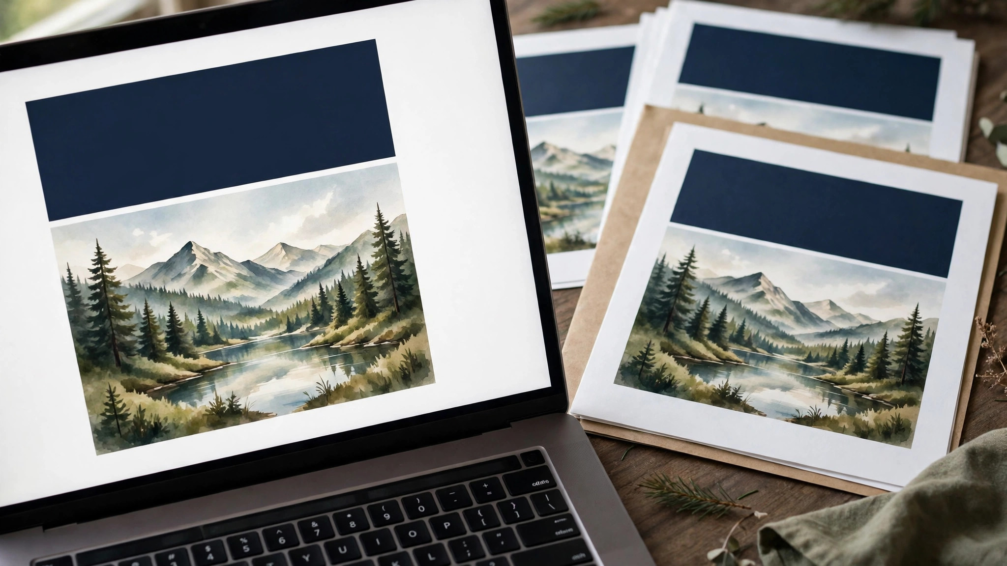
Canva is the best free starting point for a book cover. Its free plan includes book cover templates in the standard 6 by 9 inch size, photo editing, and PDF export. Canva Pro, at $18 a month or $144 a year, adds premium templates, background removal, and brand kits. A cover built in Canva can look professional, if the author follows the genre rules and tests the thumbnail. Its weakness is originality, because thousands of authors use the same templates, so a Canva cover must be customised hard to stand out.
Adobe Express is the best free alternative. Its free plan includes templates, Adobe Fonts, and stock photos, and Premium at $9.99 a month adds more templates and 100 GB of storage. Its font range is deeper than Canva, which matters for a title that must carry the cover. Its editor is simpler in places, which suits a fast cover for a short book or a series where consistency matters more than uniqueness.
Reedsy is the best marketplace for hiring a professional cover designer. Its vetted designers show portfolios and prices, with custom covers typically from $300 to $800, and pre-made covers from $150. Reedsy suits an author who wants a professional cover and can afford it, because a professional designer understands genre, typography, and print in a way a template cannot. The process is structured, with a brief, a concept, and revisions, which protects both sides.
99designs is the best choice for an author who wants many ideas. Its contests invite many designers to submit concepts, and the author picks a winner, with prices from a few hundred dollars. The contest model produces variety, but it also produces many weak entries, and the author must be able to judge them. It suits an author with a clear brief and a budget for a contest, rather than an author who needs a designer to guide them.
Fiverr offers cover designers from a few dozen dollars, with portfolios and reviews to check. The quality varies widely, so the author must read reviews, check the portfolio for books in their genre, and ask for the print and ebook files in the right sizes. A cheap cover from a designer with no genre experience will cost more in lost sales than a professional cover costs to buy. The rule is to hire for genre experience, not for price.
Print Size, Ebook Size and the Spine
Print and ebook covers are different files, and they need different sizes. An ebook cover is a single front image, usually 1600 by 2560 pixels, in a 1.6 to 1 ratio, saved as a JPG or PNG. A print cover is a full wraparound, with the front, the spine, and the back, in a PDF at 300 DPI, with a 3 mm bleed. A cover built for ebook will fail in print, because it has no spine or back. A cover built for print will fail as an ebook, because the wraparound does not fit the ebook frame.
The print size depends on the book, and getting it right is a practical part of how to design a book cover that sells. A standard paperback is 6 by 9 inches, or 5.5 by 8.5 inches, and the cover file must match the page count, because the spine width grows with the number of pages. A book of 200 pages has a thinner spine than a book of 400 pages, and the cover file must be built to the exact spine width the printer calculates. Amazon KDP provides a cover template calculator that generates the exact file size for a given page count and paper type, and it should be used for every print cover.
The spine is the part of the cover most authors forget. It needs the title, the author name, and the publisher, in a font large enough to read on a shelf, with space at the top and bottom so the text is not cut. A spine with text too small, or text that runs to the edge, will look amateur on a shelf, and a book that cannot be found on a shelf cannot be bought in a shop. A book with fewer than 130 pages may have no spine text at all, because the spine is too thin to hold it.
Bleed and safe zones apply to print covers as they do to flyers. Set a 3 mm bleed on every edge, and keep all text at least 6 mm inside the trim edge, in the safe zone. A title near the edge will be trimmed, and a barcode in the wrong place will be rejected by the printer. Order a proof copy before you approve the print run, because a proof shows the colours, the trim, and the spine in a way a screen never can.
Colour mode matters for print. Screens use RGB, printers use CMYK, and the two do not match exactly. A bright RGB blue will print duller in CMYK, and a neon colour will soften. Export the print cover as a PDF in CMYK, and check the proof in daylight. If the colours look wrong in the proof, adjust them before the print run, because a batch of books with the wrong colours is a batch that cannot be sold.
Series Covers, Branding and the Long Game
A series needs a cover system, not a single cover, and planning that system is part of how to design a book cover that sells across many books. The covers should share a layout, a font, and a colour palette, with the image changing for each book. A reader who loved the first book should recognise the second in a second, from the shelf or the screen. A series where each cover looks unrelated will lose readers, because they will not know the books belong together.
The series brand is built from three elements. The title font, which stays the same across the series. The layout, which places the title, the image, and the author name in the same positions. And the colour palette, which shifts slightly for each book while staying in the same family. A thriller series might use dark blue for book one, dark green for book two, and dark red for book three, all with the same font and layout. The reader recognises the system, and the system sells the next book.
The author brand matters too. An author who writes in one genre should keep a consistent cover style across all their books, so readers learn to recognise the author as well as the series. An author who writes in two genres should use a different style for each, or a pen name, because a reader who buys a romance expecting a thriller will be disappointed, and a disappointed reader will not buy the next book.
Update the cover when the book changes. A new edition, a new price, or a new format deserves a cover check, because the cover that sold the first edition may not sell the second. A cover that has been in the store for two years may need a refresh, with a new image or a new colour, while keeping the title font and the layout. A refresh that keeps the brand and changes the image is a safe update. A refresh that changes everything is a new book, and it will lose the readers who recognised the old one.

Mistakes That Kill Book Sales
The first mistake is a cover that ignores the genre. A romance cover on a thriller, or a thriller cover on a children’s book, will attract the wrong readers and disappoint them, and it will be ignored by the right readers. The fix is the genre study, with the top twenty covers in the genre as the guide. A cover that fits the genre will be recognised. A cover that fights it will be ignored.
The second mistake is a title that cannot be read at thumbnail size. A thin font, a small size, or a colour that matches the image will make the title disappear on a phone, and a book with no readable title will not be clicked. The fix is a large, bold title, in a contrasting colour, tested at thumbnail size on a real phone. A title that reads at thumbnail size will sell. A title that does not will not.
The third mistake is too many images. A cover with five images, three fonts, and a tagline, a quote, and a badge is a cover with no focus, and the reader’s eye has nowhere to land. The fix is one strong image, two fonts at most, and a clear hierarchy. A simple cover with one strong idea will outsell a busy cover with ten ideas, because the simple cover can be understood in three seconds.
The fourth mistake is a DIY cover that looks DIY. A cover built from a free stock photo, a default font, and no genre study will look like a first attempt, and readers will treat it as one. The fix is either to study the genre hard and customise the template until it looks professional, or to hire a designer. A professional cover costs money, and it earns it back in sales, while an amateur cover costs sales every day it is live.
The fifth mistake is forgetting the back cover. A front cover that sells the click and a back cover that bores the reader will lose the sale at the last step. The fix is a blurb that teases the story, a short bio, and a clean layout, with the barcode in the right place. A back cover that sells is the final step in a cover that sells, and it deserves the same care as the front.
Related Guides
- How to Remove Background from Product Photos
- How to Switch from Canva to Figma for Branding
- Midjourney vs DALL-E for Small Business
Frequently Asked Questions
How much does a professional book cover cost?
A pre-made cover costs from around $150, and a custom cover from a professional designer costs from $300 to $800, depending on the designer’s experience and the genre. A cover from a marketplace such as Reedsy or 99designs sits in that range, while a cover from Fiverr can cost less, with quality varying widely. A professional cover is an investment, and it earns its cost back in sales.
What size should a book cover be?
An ebook cover should be 1600 by 2560 pixels, in a 1.6 to 1 ratio, saved as a JPG or PNG. A print cover is a full wraparound PDF at 300 DPI, with the front, spine, and back, sized to the book’s page count and paper type. Use the printer’s cover template calculator, such as Amazon KDP, to generate the exact size for your book.
Can I design a book cover myself?
Yes, with Canva or Adobe Express, if you study the genre first, follow the thumbnail test, and customise the template hard. A self-designed cover can look professional, but it takes time and a good eye. An author who wants the best result and can afford it should hire a designer with genre experience, because a professional cover sells more books.
How do I know if my book cover is good?
Shrink it to thumbnail size and look at it on a phone. If the title reads, the genre is clear, and the image is striking, the cover works. Then place it next to five bestsellers in your genre, and ask whether a reader would pick yours. If the answer is no, find the one thing that makes yours weaker, and fix that one thing.
Should the author name be bigger than the title?
For a new author, no. The title should be larger than the author name, because the title is what sells the book. For a famous author, the name can be larger than the title, because the name is what sells the book. A new author who sets their name larger than the title is asking readers to buy a name they do not know.
What should go on the back cover?
The back cover should have a blurb of 100 to 150 words that teases the story without spoiling it, a short author bio of three lines, and space for the barcode in the bottom right corner. Keep the layout clean, with the blurb in a readable size, and never let the barcode cover the text.
The Bottom Line
Knowing how to design a book cover that sells is a genre-first skill, not a decoration skill. Study the top covers in your genre, choose one strong image, set a large readable title, and test the cover at thumbnail size on a phone. Canva will build it free, Adobe Express will polish it, and a professional designer from Reedsy will make it sell even better.
Start with the genre, build the cover around one concept, and test it next to the bestsellers. That routine is how to design a book cover that sells, for a first novel or a tenth. The cover that sells is the one that looks like it belongs in its genre, reads clearly at thumbnail size, and makes the right reader stop scrolling. That is the cover worth publishing.
2 thoughts on “How to Design a Book Cover That Sells”