A listener scrolling through Apple Podcasts gives your show about one second. One second to decide whether the little square next to your title looks like a show worth their time or just another entry in an endless list. Most new podcasters spend weeks on microphones and editing, then throw together cover art in ten minutes. That order is backwards. The art is the first thing anyone sees, and it is the only thing they see before they press play. Learning how to create podcast cover art properly is not a design luxury. It is the cheapest marketing your show will ever get.
The good news is that you do not need design training or paid software. Apple and Spotify both want the same thing, a square image at 3000 by 3000 pixels, and every free tool in this guide can make one. What matters is not the tool. It is the size, the contrast, the words you choose to put on the square, and the test you run at thumbnail size before you upload. This guide walks through how to create podcast cover art from start to finish, from the exact specs to the step by step build to the mistakes that make good shows look amateur.
Quick jump
- Quick Answer. How to Create Podcast Cover Art in One Afternoon
- The Size and Specs That Decide Whether Your Cover Gets Accepted
- The Tools Worth Using for Podcast Cover Art
- How to Create Podcast Cover Art, Step by Step
- Design Rules That Make a Cover Readable at 60 Pixels
- Mistakes to Avoid With Your Podcast Cover Art
- Before You Publish. The Cover Checklist
- How to Choose the Right Tool for Your Cover
- Related Guides
- Frequently Asked Questions
- The Bottom Line
Quick Answer. How to Create Podcast Cover Art in One Afternoon
Here is the short version. Learning how to create podcast cover art comes down to five moves. Start a square canvas at 3000 by 3000 pixels in a free tool such as Canva or Adobe Express. Pick one strong image, a face, an object, or a bold colour field, and keep the background simple. Put your show name in large, bold type and add at most five more words. Export as a JPG or PNG under the file size limit, then shrink the image to the size of a postage stamp on your screen and check that you can still read every word. If you can, upload it.
The whole job takes one to two hours the first time and under thirty minutes once you have a template.
The single test that matters most is the small size test. Your art will spend most of its life at 60 to 150 pixels wide in app lists and search results. A design that looks stunning at full size and turns to mush at 60 pixels has failed at its only job. Design for the small version first and the big version takes care of itself.
| What you need | The number to use |
|---|---|
| Canvas size | 3000 x 3000 pixels |
| Minimum accepted size | 1400 x 1400 pixels |
| Shape | Square, 1 to 1 ratio |
| File formats | JPG or PNG |
| Colour mode | RGB |
| Best free tools | Canva, Adobe Express, Photopea |
| Time for a first cover | 1 to 2 hours |
The Size and Specs That Decide Whether Your Cover Gets Accepted
Apple Podcasts sets the rules that almost every other app follows. Your art must be square, between 1400 by 1400 and 3000 by 3000 pixels, in JPG or PNG format, using RGB colour. Apple recommends 3000 by 3000, and that is the size to build at. Spotify asks for the same 3000 by 3000 square. Build once at the recommended size and the file works everywhere, from Apple to Spotify to Google Podcasts listings and the social posts you make from the same image.
File size has a limit too. Apple caps the upload at 512 KB in its current documentation for some hosts, while many podcast hosts accept larger files and compress them on upload. The practical rule is simple. Export a JPG at 80 to 85 percent quality and you will usually land well under the limit with no visible loss. A PNG with flat colours and sharp text can stay small too, but a photographic PNG can balloon past the limit fast. If your host rejects the file, switch to JPG before you start cutting quality elsewhere.
Resolution is the other trap. A cover built at 1400 by 1400 and stretched later looks soft on the large artwork pages in Apple Podcasts and Spotify, where the art is shown at hundreds of pixels wide. A cover built at 3000 by 3000 stays sharp everywhere. Starting at full size costs nothing and protects every later step, so there is no reason to build small. Save the editable project file as well as the export. You will want it when the show changes its name, its season, or its branding in six months.
One more spec matters and it is easy to miss. Your art must not contain a logo for Apple, Spotify, or any other platform, and it should not include the words Apple Podcasts or Spotify in the design. The platforms reject art that looks like an official badge. Keep your own show name and your own imagery on the square and nothing else that belongs to a platform.
The Tools Worth Using for Podcast Cover Art
You do not need paid software to make art that looks professional. The tools below all handle a 3000 by 3000 canvas, and each one suits a different kind of podcaster. Pick the one that matches how you already work, because the fastest tool is the one you will actually finish with. All of them work for how to create podcast cover art at the full 3000 by 3000 size, so the choice is about your habits, not the feature list.
Canva. The Fastest Start for Most Podcasters
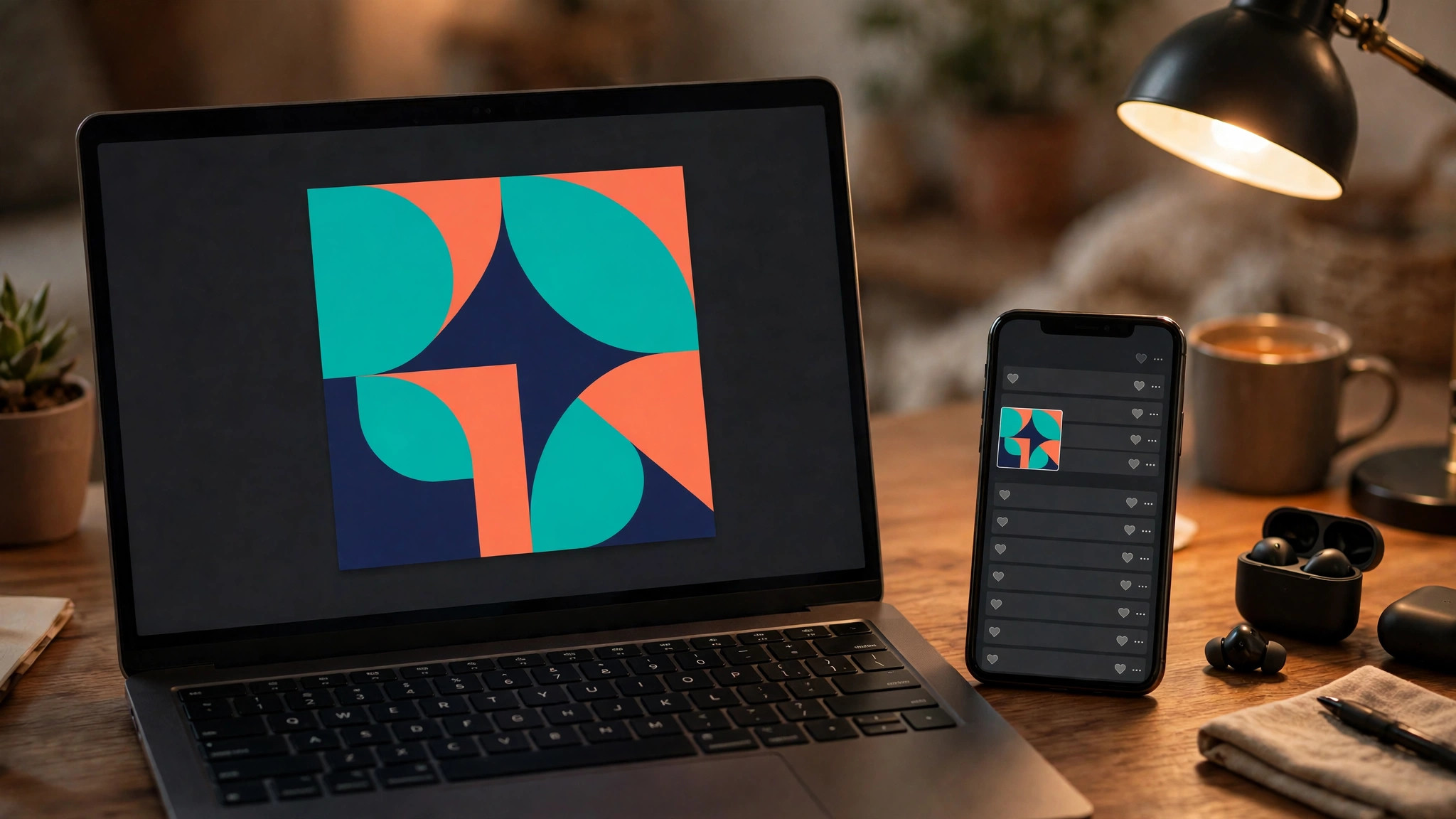
Canva is the default choice for a reason. Search for podcast cover in its template library and you get hundreds of starting points already sized at 3000 by 3000, with layouts built for show names, host photos, and genre moods. The free plan covers the whole job, including text, shapes, stock photos, and JPG or PNG export. Canva Pro, at about 120 dollars a year in 2026, adds background removal, a brand kit that stores your colours and fonts, and a one click resize tool, but none of those are required for a good cover.
The strength of Canva is speed. A first cover takes under an hour when you start from a template and swap in your own words and photo. The weakness is sameness. Thousands of shows use the same popular templates, so a cover built straight from a template can look like every other show in your category. Fix that by changing the background photo, the font pairing, and the colour scheme, and by rewriting the title treatment in your own style. Three changes are enough to make a template look like yours.
Adobe Express. The Best Free Plan for Photo Led Covers
Adobe Express is the closest rival to Canva and the better pick if your cover leads with photography. Its free plan includes background removal, which Canva charges for, plus Adobe Fonts and a solid template library. Premium costs 9.99 dollars a month or 99.99 dollars a year, and adds more templates, more fonts, and generative AI credits. For a cover, the free plan does the job, and the photo tools are genuinely strong.
Adobe Express also handles text well. Its font library is deeper than Canva’s free tier, which matters when your show name has to carry the whole design. If you already use Adobe products, or if you want your cover photo to look polished without paying for a photo editor, start here. The main drawback is a smaller template library than Canva, so you may spend a few extra minutes building a layout from scratch.
Photopea. The Free Editor for Full Control
Photopea is a free photo editor that runs in the browser and works like Photoshop. It opens PSD files, supports layers and masks, and exports JPG and PNG at any quality you choose. It has no templates, so you start from a blank 3000 by 3000 canvas and build everything yourself. That makes it slower for a first cover, but it is the best free option when you want precise control over a photo, a cutout, or a layered design that template tools cannot do.
Photopea suits podcasters who already know their way around layers, or who have a PSD template from a designer. If you have never used a layer based editor, the learning curve will cost you an hour on the first cover and save you time on every cover after that. Keep a safe margin in mind while you place text. Nothing important should sit flush against the edge of the square, because apps round the corners of your art in some views.
Snappa and VistaCreate. The Quick Alternatives
Snappa and VistaCreate both offer podcast cover templates with a simpler interface than Canva. Snappa’s free plan allows a limited number of downloads a month, which is fine for a single cover, and its templates lean clean and minimal. VistaCreate, formerly Crello, offers a large template library and a free plan that covers cover design, with a paid plan for more assets. Neither tool beats Canva on template count, but both are worth a look if Canva’s interface feels crowded to you.
Headliner deserves a mention too, because it is built for podcasters. It makes audiograms and cover art from your show, and its templates are tuned to podcast genres rather than general design. If your show already lives on Headliner for audiograms, making the cover there keeps everything in one place. The right choice is the one where you finish the cover instead of browsing templates for an evening.
| Tool | Free plan covers a cover | Paid price in 2026 | Best for |
|---|---|---|---|
| Canva | Yes, fully | Pro about 120 dollars a year | Fastest start, biggest template library |
| Adobe Express | Yes, fully | Premium 9.99 dollars a month or 99.99 a year | Photo led covers, free background removal |
| Photopea | Yes, fully | Free | Full layer control, PSD files |
| Snappa | Yes, limited downloads | Paid plans from about 10 dollars a month | Clean minimal layouts |
| VistaCreate | Yes | Paid plans from about 10 dollars a month | Large template library |
| Headliner | Yes, limited | Paid plans from about 7.99 dollars a month | Podcasters who also make audiograms |
How to Create Podcast Cover Art, Step by Step
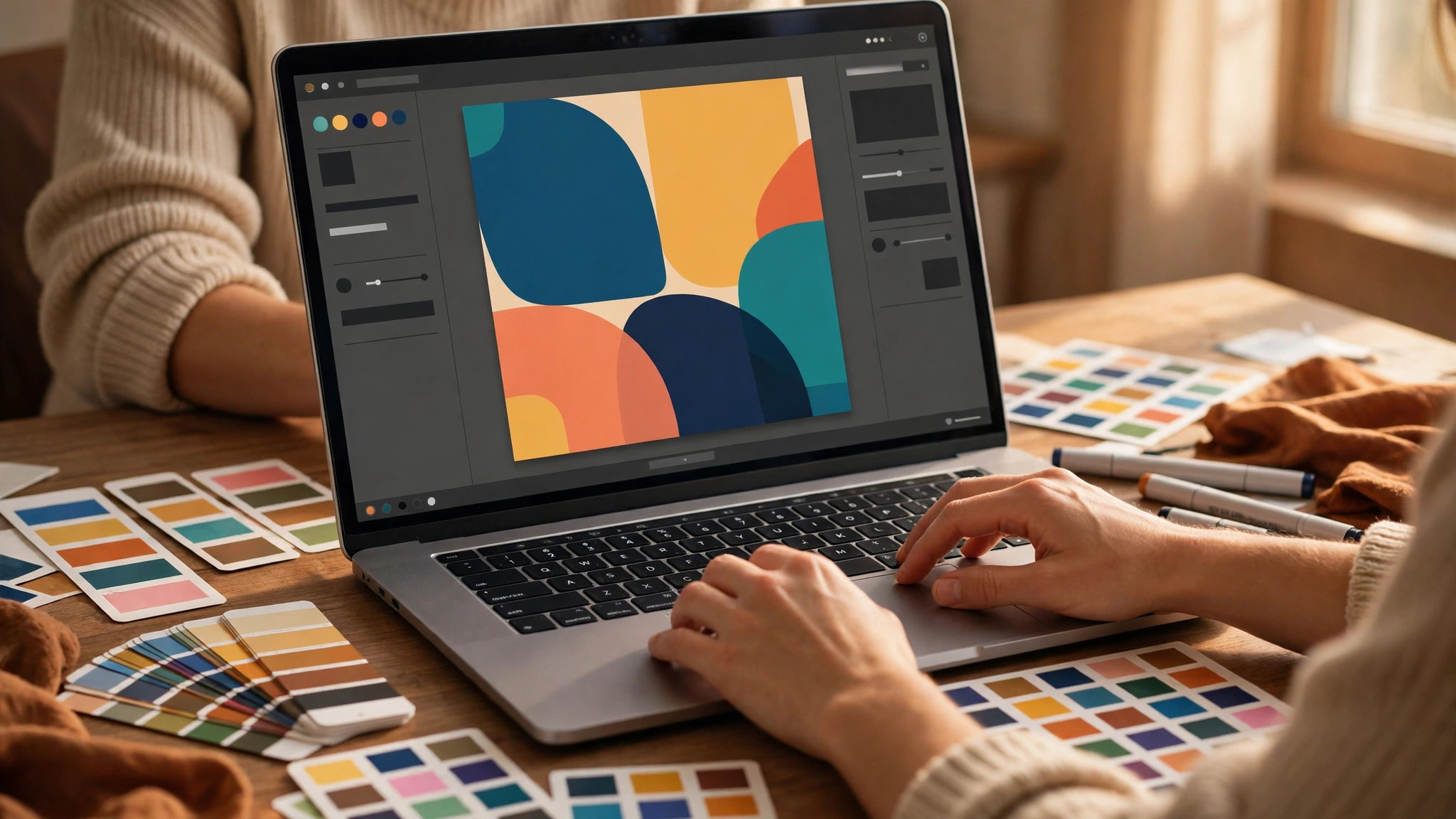
With the specs and the tool chosen, the build itself follows eight steps. Work through them in order and resist the urge to skip the test at the end. The test is where most covers are saved.
Step 1. Open a 3000 by 3000 Canvas
Open your chosen tool and create a custom canvas at 3000 by 3000 pixels, or search for the podcast cover template. Do not start from a 1080 by 1080 canvas and stretch it later. A stretched cover looks soft on the large artwork pages, and your host will accept the smaller file without warning you. Starting at full size costs nothing and protects the quality of every later step.
Step 2. Choose One Strong Image
Pick one image to carry the cover. A clear face works best for interview and solo shows, because listeners subscribe to people. A single bold object works best for topic shows, a guitar for a music show, a whisk for a cooking show, a dumbbell for a fitness show. A strong colour field with big type works best for news and commentary shows, where the words are the brand. One image, not three. Three competing images split attention and turn to noise at 60 pixels.
Step 3. Set the Background
Fill the square with your background. A single photo with a darkened area for text works for most shows. A flat colour with a subtle texture works for shows that lead with type. Keep the background simple and slightly darkened where text will sit, because words have to sit on top of it. If the photo is busy, add a dark overlay at 40 to 60 percent opacity across the middle, or place a solid colour panel behind the text. Contrast is what makes a cover readable, not a brighter photo.
Step 4. Place the Show Name in Large Type
Add your show name in a large, bold font. The name should take up at least a third of the square height, because it shrinks to a few millimetres wide in app lists. Use one font for the name and, if you need a second line, one clean font for the rest. Avoid script fonts for the name, because thin strokes vanish at small sizes. Avoid using three or four fonts, because the cover starts to look like a ransom note. If your show already has a font from your website or social posts, use that same font here.
Step 5. Add At Most Five More Words
If the show name alone does not say what the show is about, add a short line under it. Five words at most. “True crime, solved slowly.” “Money, in plain English.” “Stories from the night shift.” Anything beyond that is noise, and noise is what makes a cover look crowded at phone size. If your show name already says the topic, skip this line entirely. A cover with only a name and a face is often the strongest cover in a category.
Step 6. Add a Face or a Logo, Not Both Competing
Place your photo or your logo in the square, usually on one side of the text or behind it. If you use a photo, crop it tightly and keep the face large. Small faces disappear on phones. If you use a logo, keep it simple and make sure it reads at 100 pixels wide. Do not add a face and a logo and an object all fighting for the same space. Two competing images split attention and make the cover look crowded.
Step 7. Export at the Right Settings
Export as a JPG at 80 to 85 percent quality for photographic covers, or as a PNG for covers with flat colours and sharp text. Check the file size against your host’s limit. If it is over the limit, lower the JPG quality or flatten the image before export. Name the file clearly, something like show-cover-2026.jpg, so you can find it again when you redesign. Keep the editable project file too. You will want it when you change the show name or the branding in six months.
Step 8. Test at Thumbnail Size, Then Upload
Shrink the exported image to 150 pixels wide on your screen, then to 60 pixels wide. Read every word. If you can read the show name at 60 pixels, the cover passes. If you cannot, go back to the design, make the type bigger, cut words, or raise the contrast, and test again. Then upload the file in your podcast host and check how it looks in Apple Podcasts and Spotify on your own phone. This test takes three minutes and catches the errors that ruin most covers.
Design Rules That Make a Cover Readable at 60 Pixels
Size and specs get your cover accepted. Design is what makes it look like a show worth subscribing to. The rules below are simple, and breaking any one of them is visible at a glance, even to a listener who knows nothing about design.
Contrast comes first. White text on a light photo is unreadable, and dark text on a dark photo is unreadable too. The fix is a dark overlay behind the text, a solid panel, or a photo with a naturally dark area in the middle. Test the cover by shrinking it to phone list size on your screen. If you can still read every word without squinting, the contrast is right. If you cannot, add the overlay and test again. That one check is the heart of how to create podcast cover art that survives the app lists.
Colour comes second. Two colours plus white or black is enough. Pick colours that match your show and your mood. A true crime show reads well in dark red and black. A money show reads well in deep green and warm cream. A comedy show reads well in bright yellow and dark purple. The colours should also match your social posts and your website, so the show feels like one place instead of a collection of unrelated images. When in doubt, use the colours already in your logo and add white text.
Space comes third. A cover needs empty room around the text. Crowded covers happen when a podcaster tries to fit the show name, a tagline, a schedule, three social media handles, a website address, and a quote into one small square. Leave the social handles and the website out of the cover entirely. Your show page already shows your links, and the cover is not the place to repeat them. Empty space is not wasted space. It is what lets the important words stand out.
Faces come fourth, when they fit the show. A clear face builds trust fast, because listeners subscribe to people, not to logos. If you are the face of the show, put your face on the cover, large and well lit, looking toward the text rather than away from it. If the show is about a topic rather than a person, skip the face and let the subject carry the cover. A forced face on a show about software tools looks odd, and listeners notice.
Mistakes to Avoid With Your Podcast Cover Art
Most bad covers fail in the same few ways, and each one is easy to avoid once you know to look for it. Run through this list before you upload, because fixing a cover after it is live costs the same ten minutes as fixing it before, but the live version is the one strangers judge you by. Most of these errors come from rushing the small size test, which is the step people skip most often when they learn how to create podcast cover art.
The first mistake is too much text. A cover is not a paragraph. If your tagline needs two lines, shorten it. If your subtitle needs an explanation, drop it. The test is simple. Read the cover aloud in one breath. If you run out of breath, cut words until you do not.
The second mistake is a low resolution image. A cover built at 1080 by 1080 and stretched to 3000 by 3000 looks blurry on the large artwork pages. Always start at full size. If your only photo is small, use it as a background with a dark overlay rather than stretching it across the whole square, or pick a new photo at full resolution.
The third mistake is text at the very edge. Apps round the corners of your art in some views, and text that sits flush against the edge gets clipped or looks cramped. Leave a margin of at least 100 pixels on every side at full size. Nothing important should touch the border.
The fourth mistake is a cover that does not match the show. A comedy show with a dark, serious cover confuses the listener who clicked through from a funny clip. A finance show with a cartoon cover confuses the listener who wants serious advice. Match the cover mood to the episodes you actually publish, because a mismatch costs subscribers in the first three seconds.
The fifth mistake is using a photo you do not have the right to use. A cover built from a random image found in a search can lead to a copyright claim against the show. Use your own photos, stock photos from the tool you design in, or images with a clear licence for commercial use. This matters more than most podcasters think, because the cover is the most visible image of the show.
The sixth mistake is never updating the cover. A cover that promises weekly episodes on a show that now publishes monthly is worse than no schedule at all. A cover that shows an old logo or an old photo after a rebrand tells listeners the show is neglected. Review the cover every season, and update it whenever your schedule, your topic, or your branding changes. The editable project file you saved makes this a fifteen minute job.
Before You Publish. The Cover Checklist
Use this checklist as the last step before you upload. Every item should be a yes. If any item is a no, fix it in the design tool and check again.
– The canvas is 3000 by 3000 pixels, and the file is under your host’s size limit. – The show name reads clearly at 60 pixels wide, with strong contrast against the background. – The cover uses two fonts at most and three colours at most. – Nothing important sits flush against the edge of the square. – The background photo is your own or properly licensed, and it is sharp at full size. – The colours and mood match your episodes and your social posts. – You have checked the cover on your own phone in Apple Podcasts and Spotify. – The editable project file is saved, so the next update takes minutes.
How to Choose the Right Tool for Your Cover
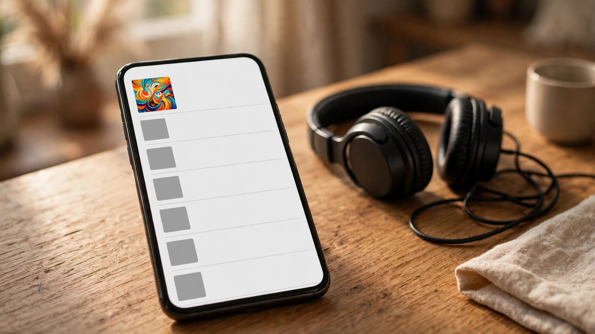
The tool matters less than the size and the small size test, but the wrong tool can still waste an evening. Choose by how you work, not by which tool has the longest feature list. If you want a finished cover in under an hour, use Canva or Adobe Express and start from a template. If you want precise control and you know layers, use Photopea. If you want the simplest possible interface, try Snappa.
The best pick by job is straightforward. Canva wins for most podcasters because of its template library and speed. Adobe Express wins for photo led covers because background removal is free. Photopea wins for podcasters who already edit in layers and want a PSD workflow.
There is no wrong answer among the three, only a slower one, and the slower one is whichever tool you have to learn from zero on the day you need the cover.
Budget is the other factor, and here the news is good. A professional cover costs nothing but your time, because every tool above has a free plan that covers the whole job. Paid plans buy convenience, not quality. Canva Pro buys a brand kit and background removal. Adobe Express Premium buys more templates and AI credits. Neither one makes a cover look better on its own. Spend money only when you are making covers, audiograms, and social posts every week and the time saved pays for the subscription. For a single cover, the free plan is the right call.
Related Guides
- Piktochart vs Venngage Infographics
- Best Infographic Makers for Small Business: Complete 2026 Guide
- Best Instagram Post Makers
Frequently Asked Questions
How to create podcast cover art for free?
Open Canva, Adobe Express, or Photopea in your browser and start from a podcast cover template or a custom 3000 by 3000 canvas. All three are free for the cover workflow, including text, shapes, stock photos, and JPG or PNG export. Add your show name in large bold type, keep the words to a minimum, export under your host’s size limit, and test the image at 60 pixels wide before you upload it. The free plans cover everything a good cover needs.
What size should podcast cover art be?
Build at 3000 by 3000 pixels, which is the size Apple Podcasts and Spotify recommend. The smallest file Apple accepts is 1400 by 1400 pixels, and the file must be square, in JPG or PNG format, using RGB colour. Design at the full recommended size even if you only listen on a phone, because a larger file stays sharp on the big artwork pages in the apps.
Why does my podcast cover look blurry?
Your art was probably built smaller than 3000 by 3000 and stretched, or exported as a low quality JPG. Always start at full size and export a JPG at 80 to 85 percent quality, or a PNG for flat colour designs. If your only photo is small, use it as a background with a dark overlay rather than stretching it across the whole square, or pick a new photo at full resolution.
Can I use a photo as my podcast cover?
Yes, and a strong photo often makes the best cover. Use a clear, high resolution photo that fits your show, keep the show name large and readable, and add a dark overlay behind the text so it stays readable at small sizes. Make sure you own the photo or have a licence to use it, because a cover built from a random search image can lead to a copyright claim.
How many words should be on podcast cover art?
As few as possible. Your show name plus at most five more words is the rule that works. A name and a short line is enough for a listener to understand the show in one second. More words shrink the type, crowd the square, and turn to noise at list size. If your show name already says the topic, skip the extra line entirely.
How often should I update my podcast cover art?
Review it every season and update it whenever your schedule, topic, logo, or branding changes. A cover that shows an old logo after a rebrand tells listeners the show is neglected. Keep the editable project file from your design tool, and each update takes about fifteen minutes.
The Bottom Line
A good cover is a small job with an outsized return. One square file, built at 3000 by 3000 with the show name large and readable at 60 pixels, tells a stranger what your show is about in one second and gives them a reason to press play. The tools are free, the process takes an afternoon, and the checklist above catches the errors that ruin most first attempts.
Build it once, test it on a phone, save the project file, and revisit it every season. That is the whole craft of how to create podcast cover art in one line. Your show page will look like it belongs to a podcaster who takes the work seriously, because it does.
2 thoughts on “How to Create Podcast Cover Art”