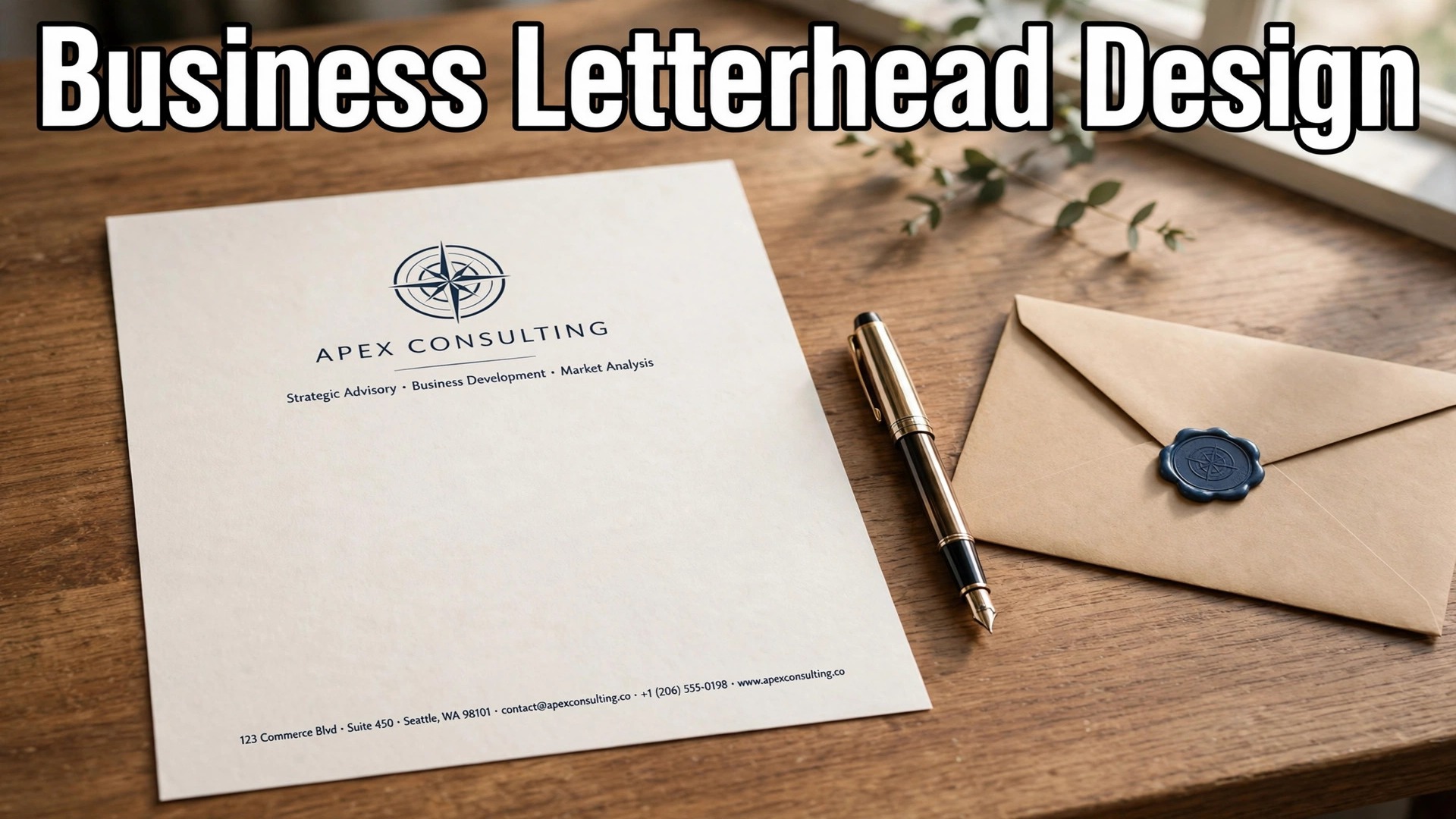
A letter on plain paper and the same letter on a designed letterhead do not carry the same weight. The words are identical, but the reader’s first judgement is different, and that judgement forms before a single sentence is read. A letterhead tells a client, a supplier, or a partner that the business behind the letter is organised, established, and serious about detail. That is why learning how to design a letterhead for your business is worth an hour of your time.
It is a small piece of design with an outsized effect on trust, and it is also one of the cheapest brand assets a business will ever make. It takes about an hour, costs nothing if you use a free tool, and produces a file you will use for years.
A letterhead is the printed header of a business letter. It carries the logo, the business name, and the contact details, and it frames the letter that follows. The best letterheads are restrained. One logo, two fonts at most, two or three colours, and generous white space. The worst are crowded, with five colours, three fonts, a watermark, a slogan, and a border fighting for attention on a single page. The difference between the two is not design talent. It is discipline, and this guide works through the decisions in order, from size and layout to file settings and printing.
Quick jump
- Quick Answer. How to Design a Letterhead for Your Business in One Hour
- What a Letterhead Has to Do
- Sizes, Margins, and the Space the Letter Needs
- The Best Free Tools for a Letterhead
- How to Design a Letterhead for Your Business, Step by Step
- Design Rules That Make a Letterhead Look Professional
- Paper, Printing, and Cost
- Mistakes to Avoid With Your Business Letterhead
- How to Choose the Right Tool for Your Letterhead
- Related Guides
- Frequently Asked Questions
- The Bottom Line
Quick Answer. How to Design a Letterhead for Your Business in One Hour
Here is the short version. Open Canva or Adobe Express and start from a letterhead template at US Letter size, 8.5 by 11 inches, or A4 at 210 by 297 millimetres if you work outside North America. Place your logo at the top, add your business name, address, phone, email, and website in a clean font, and keep the design to two colours and two fonts. Leave the middle of the page empty for the letter itself, add a small footer with your website or registration details, and export a print-ready PDF at 300 dots per inch.
Print a test copy on good paper, check that the logo is sharp and the text is readable, and save the editable file so every future letter matches. The whole job takes about an hour for a first letterhead and twenty minutes once the template exists.
| The decision | The standard choice | Why it works |
|---|---|---|
| Page size | US Letter 8.5 by 11 inches, or A4 210 by 297 mm | Matches the paper your printer and your reader use |
| Logo position | Top left, or centred at the top | The first thing a reader sees |
| Fonts | Two at most, one for the name, one for details | Keeps the page calm and readable |
| Colours | Two plus black, matching the logo | Looks professional, prints cheaply |
| Paper weight | 24 to 32 lb, or 90 to 120 gsm | Feels substantial without jamming the printer |
| File format | PDF at 300 DPI, CMYK for print | Prints sharply and colours stay true |
| Best free tools | Canva, Adobe Express, Google Docs | Templates, free export, no design skill needed |
| Time for a first letterhead | About an hour | Most of it is deciding, not designing |
What a Letterhead Has to Do
A letterhead has three jobs, and only three. It identifies the sender, it gives the reader a way to reply, and it makes the business look credible. Every choice in how to design a letterhead for your business should serve one of those three jobs. Anything that serves none of them is decoration, and decoration is the enemy of a good letterhead.
Identification is the logo and the business name. A reader who opens an envelope should know within one second who sent the letter. That means the logo is clear, the name is legible, and neither is hidden in a corner or shrunk to fit around something else. If the business has a tagline, it can sit under the name in a smaller size, but only if it adds information. A tagline that says nothing, or that repeats the business name, adds noise.
Contact is the address, phone, email, and website. These go in the header or the footer, in a small but readable size, usually 8 to 10 points. The reader needs to find them without hunting, and they need to be accurate. A wrong phone number on a letterhead is worse than no phone number at all, because the reader will trust the letterhead and call a stranger. Check every digit before you print.
Credibility is the hard one to define and the easy one to spot. A credible letterhead looks considered. The spacing is even, the alignment is straight, the colours match the logo, and nothing is crowded. An incredible letterhead looks like it was made in a hurry. The reader may not know why the second one feels wrong, but they will feel it, and the letter that follows will be read with less trust.
Sizes, Margins, and the Space the Letter Needs
The page size is the first decision, and it is the easiest. Size is the first step in how to design a letterhead for your business, and getting it wrong means rebuilding the whole page. In the United States and Canada, business letters use US Letter, 8.5 by 11 inches. In most of the rest of the world, they use A4, 210 by 297 millimetres. Use the size your printer, your paper supplier, and your reader expect. A letterhead built for A4 and printed on US Letter will lose its margins, and the design will look wrong even if nothing else changes.
Margins matter more than most people expect. Leave at least 1 inch, or 25 millimetres, on the left and right, and at least 0.75 inches, or 19 millimetres, at the top and bottom. The header sits inside the top margin, and the footer sits inside the bottom margin. The body of the letter gets the space between them, which is about 8 inches of usable height on a Letter page. If the header is too tall, the letter has nowhere to go, and the page looks top-heavy. Keep the header to about 1.5 inches of height, including the logo and the contact line.
The body area is the part of the page you must leave empty. A letterhead is a frame, not a poster, and the middle of the page belongs to the letter. Do not fill it with a watermark, a background image, or a pattern. A faint watermark behind the text looks elegant on screen and ruins readability in print, because the printer lays grey over the words. If you want a background element, keep it in the header or the footer, where it cannot fight the letter.
Bleed is the last sizing detail, and it matters only if your design runs to the edge of the page. Most letterheads do not need bleed, because the design sits inside the margins. If yours does run to the edge, add 0.125 inches, or 3 millimetres, of bleed on all sides, and tell the printer. A design without bleed that touches the edge will print with a thin white line where the paper was cut. A design with bleed prints cleanly to the edge.
The Best Free Tools for a Letterhead
You do not need paid software to make a letterhead that looks professional. The tools below all offer letterhead templates at the right size, and each one suits a different kind of business.
Canva. The Fastest Start
Canva is the default choice for a reason. Search for letterhead and you get hundreds of templates at the right size, with the layout already solved. Pick one that matches your logo colours, swap in your own logo and contact details, and export a PDF. The free plan covers the whole job, including the templates, the text tools, and the PDF export. Canva Pro, at about $18 a month or $144 a year, adds a brand kit that stores your colours and fonts, which is worth paying for when the letterhead is one of many brand assets.
The strength of Canva is speed. A first letterhead takes thirty minutes from a template. The weakness is sameness, because thousands of businesses use the same popular templates. Fix that by changing the layout slightly, using your own logo prominently, and keeping the colours to your brand. Three changes are enough to make a template look like yours.
Adobe Express. The Best Free Plan for Typography
Adobe Express is the closest rival to Canva and the better pick when typography matters. Its free plan includes Adobe Fonts, which gives you a wider choice of professional typefaces than Canva’s free plan, and its letterhead templates are clean and restrained. Premium costs $9.99 a month or $99.99 a year and adds more templates and fonts, but the free plan covers a letterhead completely. If your logo is a wordmark and the letterhead lives or dies on the typeface, start here.
Microsoft Word and Google Docs. The Practical Choice
Word and Google Docs both offer letterhead templates, and both have an advantage the design tools do not. The letterhead lives in the same document as the letter, so you open the template, type the letter, and print. There is no export step, no file conversion, and no risk of the design shifting between programs. For a business that writes letters daily, that workflow is worth more than a prettier template.
The trade-off is design control. Word and Docs templates are simpler than Canva’s, and the layout options are narrower. If the letterhead needs a precise logo placement or a custom colour, the design tools do it better. If the letterhead needs to be fast and functional, Word or Docs is the better tool. Save the template as the default for new letters, and every letter starts with the letterhead already in place.
Vistaprint. Design and Print in One Place
Vistaprint offers letterhead design and printing together, which suits a business that wants printed letterhead rather than a file to print at home. The design tool is simpler than Canva’s, but it connects directly to the print order, so the file settings, paper choice, and quantity are handled in one place. Printed letterhead on 24 to 32 lb paper feels more substantial than a home printout, and for formal correspondence, that difference is noticeable. Use Vistaprint when you want a stack of printed sheets. Use a free design tool when you want a digital template for letters you print as needed.
| Tool | Free plan covers letterheads | Paid price | Best for |
|---|---|---|---|
| Canva | Yes, fully | Pro about $18 a month or $144 a year | Fastest start, biggest template library |
| Adobe Express | Yes, fully | Premium $9.99 a month or $99.99 a year | Typography and clean layouts |
| Microsoft Word | Yes, with a subscription or free online | Varies by plan | Letters written daily in Word |
| Google Docs | Yes, free | Free | Simple, fast, no export step |
| Vistaprint | Design tool free, print is paid | Print from a few cents per sheet in bulk | Printed letterhead stacks |
How to Design a Letterhead for Your Business, Step by Step
With the tool chosen, the build follows eight steps. Work through them in order, and print a test copy before you call it done.
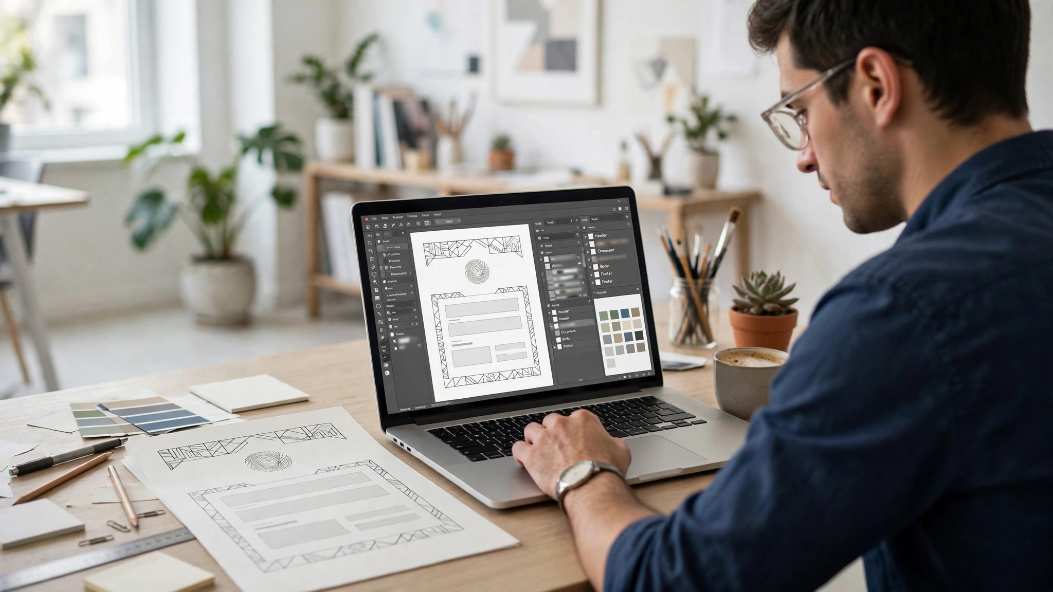
Step 1. Gather Your Logo and Contact Details
Before you open any tool, collect the assets. You need the logo as a PNG with a transparent background, or as a vector file if you have one. A logo saved from a website at low resolution will print soft and blurry, so use the original file from whoever made the logo. You also need the exact contact details. Business name, street address, phone number, email address, and website. Check every digit and every letter. A wrong detail on a letterhead is a wrong detail on every letter you send.
Step 2. Choose the Page Size and Set the Margins
Create a new document at US Letter, 8.5 by 11 inches, or A4, 210 by 297 millimetres. Set the margins to at least 1 inch on the sides and 0.75 inches at the top and bottom. If the tool offers a letterhead template at that size, start from it, and check that the size is correct before you design anything. A letterhead built at the wrong size will not fit the paper, and the fix is a rebuild.
Step 3. Place the Logo
Put the logo at the top of the page, either top left or centred. Top left is the standard business choice, and it leaves room for the contact details on the right. Centred is the formal choice, and it suits a law firm, a consultancy, or a business that wants a traditional feel. Keep the logo at a size that reads clearly without dominating the page, usually 1 to 1.5 inches wide. Do not stretch the logo to fit a space. A stretched logo looks unprofessional instantly, and a reader notices it even if they cannot say why.
Step 4. Add the Business Name and Contact Line
Add the business name in a large, clear font, usually 16 to 20 points, in the colour of the logo or in black. Under it, add a single contact line in a smaller size, usually 8 to 10 points, with the address, phone, email, and website separated by dots or vertical bars. Keep the line to one row if possible. A contact line that wraps to two rows looks untidy and wastes header space. If the details do not fit on one line, move the address to the footer and keep the phone, email, and website in the header.
Step 5. Add a Divider and a Footer
A thin rule, or line, under the header separates the letterhead from the letter and gives the page structure. Use a line in a brand colour, 1 to 2 points thick, running the width of the text area. Under the line, the letter begins. At the bottom of the page, add a footer with the website address, or with registration details such as a company number, in a small grey size. The footer is the right place for details the reader needs but does not read first.
Step 6. Choose Two Fonts and Two Colours
Use one font for the business name and one for the contact details. A serif font for the name and a clean sans-serif for the details is the classic pairing, and it suits most businesses. A modern business can use two sans-serif fonts, one bold and one regular. Avoid script fonts, because they are hard to read at small sizes, and avoid using three fonts, because the page starts to look like a ransom note. For colours, use the logo’s colours, and no more than two besides black. The header should look like it belongs to the logo, not like it was designed separately.
Step 7. Export a Print-Ready PDF
Export the letterhead as a PDF at 300 dots per inch, in CMYK colour mode if the tool offers it. CMYK matches print colours, while RGB matches screens, and a letterhead exported in RGB can print with colours that look different from the screen. Save the editable project file too, in the design tool, so you can change the phone number or the address later without rebuilding the page. Name the files clearly, something like letterhead-2026.pdf, so you can find them in six months.
Step 8. Print a Test Copy and Check It
Print one copy on the paper you will use, and read it the way a recipient would. Is the logo sharp? Is the text readable? Is the spacing even? Does the header sit straight? Hold the page at arm’s length and look at it as a whole. If anything looks off, fix it in the design tool and print again. A test print costs one sheet of paper. A stack of five hundred misprinted sheets costs real money.
Design Rules That Make a Letterhead Look Professional
Size and layout get your letterhead printed. Design is what makes it look like it belongs to a business worth trusting. These rules are the heart of how to design a letterhead for your business, because they decide whether the page looks considered or careless. The rules below are simple, and breaking any one of them is visible at a glance, even to a reader who knows nothing about design.
White space comes first. A letterhead needs empty room around the logo and the text. Crowded letterheads happen when a business tries to fit the logo, a tagline, an address, a phone, an email, a website, a registration number, and a slogan into the top two inches of the page. Leave the slogan out. Leave the registration number in the footer. White space is not wasted space. It is what lets the important details stand out.
Alignment comes second. Every element on the header should line up with something else. The logo’s left edge should line up with the text’s left edge. The contact line should sit on the same baseline as the logo’s bottom edge, or be centred under it. Misaligned elements look accidental, and accidental looks careless. Turn on the alignment guides in your design tool and use them.
Colour comes third. Two colours plus black is enough, and the colours should come from the logo. A business with a navy and gold logo should use navy and gold on the letterhead, not navy, gold, and teal. When in doubt, use one brand colour and black. A restrained letterhead looks more expensive than a colourful one, because restraint reads as confidence.
Typography comes fourth. The business name should be the largest text on the page, and it should be in a font that matches the logo’s character. A law firm in a playful rounded font looks wrong. A children’s party business in a stern serif font looks wrong. The font should fit the business, and it should be the same font the business uses everywhere else, from the website to the business card. Consistency across materials is what makes a brand feel real.
Paper, Printing, and Cost
A letterhead printed at home and a letterhead printed professionally are different products, and the difference is the paper. Paper is the part of how to design a letterhead for your business that most guides skip, and it is the part the reader feels first. Home printers handle 20 lb copy paper well, and that paper feels thin and ordinary. Professional printing on 24 to 32 lb paper, or 90 to 120 gsm, feels substantial in the hand, and the ink sits on the surface rather than soaking in. For a formal letter, that difference matters. For a routine email attachment printed at home, it does not.
If you print at home, use a laser printer rather than an inkjet, because laser text is sharper and does not smudge when the paper gets wet. Set the printer to the highest quality setting, and use the PDF export rather than printing from the design tool directly, because the PDF holds the layout steady. Print one test copy before you print a stack, and check the colours against the screen. A bright screen colour can print duller than you expect.
If you order printed letterhead, the cost depends on quantity. A small order of 250 sheets from a print shop costs a few cents per sheet plus a setup fee, and the per-sheet price falls sharply at 500 or 1,000 sheets. Vistaprint and local print shops both offer letterhead printing, and the turnaround is usually a few business days. Order the quantity you will use in a year, not the quantity that gets the lowest per-sheet price, because a letterhead with an old phone number is waste, however cheap it was.
Digital letterhead is the third option, and for many businesses it is the only one that matters. A letterhead saved as a Word or Google Docs template, or as a PDF with a fillable body, lets you write and email letters without printing anything. The design rules are the same, but the file settings change. Export in RGB for screen use, keep the file size small, and test the template by typing a long letter into it. The body text should sit neatly under the header without overlapping it, and the footer should stay at the bottom of the page on a one-page letter.
Mistakes to Avoid With Your Business Letterhead
The first mistake is a stretched or pixelated logo. A logo pulled from a website is usually too small to print cleanly, and stretching it to fill the header makes the distortion obvious. Use the original logo file, at 300 dots per inch, and keep its proportions locked. If you do not have the original file, ask whoever made the logo for it. A letterhead with a blurry logo tells the reader the business cuts corners.
The second mistake is too much information in the header. A header with an address, two phone numbers, a fax number, an email, a website, and a registration number is a directory, not a letterhead. Keep the header to the name, one phone, one email, and the website. Move the rest to the footer, or leave it off entirely. The reader can find the address on the website.
The third mistake is a letterhead that does not match the rest of the brand. A letterhead in blue and a website in green look like two different businesses. Use the same colours, the same fonts, and the same logo everywhere. The letterhead is one piece of a brand, not a standalone design.
The fourth mistake is a watermark behind the letter. A faint logo behind the body text looks elegant on screen and ruins readability in print. The printer lays grey over the words, and the letter becomes hard to read. Skip the watermark. The header carries the brand. The body carries the message.
The fifth mistake is forgetting the digital version. A letterhead that exists only as a printed stack is useless for email, and most business letters are emailed now. Save the design as a Word or Google Docs template and as a PDF, so a letter can be written, emailed, or printed from the same file. The printed stack is for formal occasions. The digital template is for daily work.
The sixth mistake is never updating the letterhead. A letterhead with an old address, an old phone number, or an old logo tells the reader the business is neglected. Review the details every year, and update the template the day anything changes. The editable project file you saved makes this a five-minute job.
How to Choose the Right Tool for Your Letterhead
The tool matters less than the logo, but the wrong tool can still waste an afternoon. Choose by how you write letters, not by which tool has the longest feature list. If you write letters in Word every day, build the letterhead in Word and skip the design tools entirely. If you write letters occasionally and want the prettiest result, use Canva and a template. If typography matters most, use Adobe Express. If you want a stack of printed sheets, use Vistaprint and order the print in the same place.
The how to design a letterhead for your business decision is really a workflow decision. A letterhead that lives in the program where you write letters will be used. A letterhead that lives in a design tool you open twice a year will be forgotten, and the next letter will go out on plain paper. Pick the tool you already open, and build the letterhead there.

Related Guides
- How to Make a Poster for Your Business
- Vistaprint vs Moo Business Cards
- Best Brochure Makers for Small Business
Frequently Asked Questions
What size should a letterhead be?
Use US Letter, 8.5 by 11 inches, in the United States and Canada, and A4, 210 by 297 millimetres, in most of the rest of the world. Match the size to the paper your printer and your reader use. A letterhead built for the wrong size will lose its margins when printed, and the design will look wrong even if nothing else changes.
What should I put on a business letterhead?
Put the logo, the business name, and the contact details a reader needs to reply. That means an address, a phone number, an email address, and a website. Keep the header to those essentials, and move secondary details such as a company registration number to the footer. Leave the middle of the page empty for the letter itself.
Can I make a letterhead for free?
Yes. Canva, Adobe Express, and Google Docs all offer free letterhead templates with free PDF export. Canva’s free plan covers the whole job, including templates, text, and export. Adobe Express is free for letterheads too, with a stronger font library. Google Docs is free and keeps the letterhead in the same document as the letter, which is the fastest workflow for daily use.
What paper should I print letterhead on?
Use 24 to 32 lb paper, or 90 to 120 gsm, for printed letterhead. It feels substantial in the hand and the ink sits on the surface rather than soaking in. Home printers handle 20 lb copy paper, which feels thin. For formal letters, the heavier paper is worth the small extra cost. Use a laser printer for the sharpest text.
Should a letterhead have a watermark?
No. A faint watermark behind the body text looks elegant on screen and ruins readability in print, because the printer lays grey over the words. Keep the branding in the header and the footer, and leave the body of the page clean for the letter. Readability matters more than decoration on a business letter.
How do I make a letterhead in Word?
Open Word, create a new document at US Letter or A4 size, and insert your logo in the header area. Add the business name and contact details under it, set the margins to at least 1 inch on the sides, and save the file as a template. Every new letter starts from that template, with the letterhead already in place. The same approach works in Google Docs, and the template can be shared with a team.
The Bottom Line
A good letterhead is a small job with a long life. One page, built at the right size, with a sharp logo, clean contact details, two fonts, and two colours, tells a reader the business is organised before they read a word. The tools are free, the process takes about an hour, and the template you save will serve every letter you send for years. Build it once, print a test copy, save the editable file, and update the details the day anything changes. Your letters will look like they come from a business that pays attention, because they do.